Email article
YouTube has always been notorious for constantly changing the look of their website, with each new design resulting in a bunch of unhappy users. This latest redesign, however, might be the first one that the majority will see as a great redesign for the world’s most popular video streaming site.
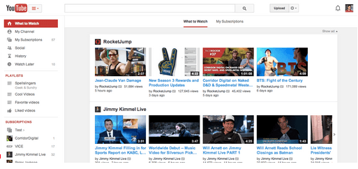
The first and most obvious difference is the new center-aligned look. The new alignment helps the site fit better with different screen sizes, and it unifies the web’s look with YouTube mobile apps. And the the left-aligned look didn’t really make much sense anyway.
“What to Watch” and “My Subscriptions” are also now more prominent on the site’s sidebar (which can be accessed or hidden), allowing you to access what’s most popular and recommended or the latest from your subscribed channels.
Another big change is the bigger emphasis on playlists. Playlists now show up on the sidebar, and now you even have the ability to “subscribe” to specific playlists. Just “like” the playlist and it will show up alongside your other saved playlists in the sidebar. That way if you like a particular kind of content but don’t want to subscribe to the entire channel, you can choose to only see updates from the playlist you want.
What do you think of YouTube’s latest redesign? Let us know in the comments!
[via YouTube]