{rw_text}Giveaway of the day for December 27, 2008 is Button Shop 3.
[rssless]————————-{/rw_text} –>
{rw_good}
- Very easy to use.
- Comes with many templates.
- Each template is fully customizable.
- You can save your button in multiple image formats.
- You can ‘pulse’ (animate) the button.
- You can generate HTML code for your button.
- Pulls off the Microsoft Office 07 look well.
{/rw_good} –>
{rw_bad}
- There is no way to start with a new completely blank button.
- You can only generate HTML code after you have saved the button as an image.
- No way to edit how the button ‘pulses’ (animation).
- Default drawing area background color is a bad choice.
- You cannot create your own texture in the program – you must import an image.
- You cannot deviate from the button shapes that are predefined in the program.
{/rw_bad} –>
{rw_score}
{for=”Features as Described” value=”10″}The developer claims that you will be able to make a button for your websites within 5 mins – it can be done within 2 =P.
{/for}
{for=”Ease of Use” value=”10″}Very easy to use. All you need to do is know how to read =).
{/for}
{for=”Usefulness” value=”7″}While not everyone has websites for which they need buttons for, the ‘buttons’ can also double as avatars, or signatures, if one is creative enough.
{/for}
{/rw_score} –>
Installation and registration were successful. Nothing had to be run as Administrator.
This program is not for the professional, but rather for the newbie. For those digital artists out there, this program will not be very useful because you will have more control over your button if you make it in image editing software like Photoshop, Gimp, etc. But for the rest of us not so talented people, being able to create relatively aesthetically pleasing buttons quickly is pretty nice.
That being said, this program comes with tons of templates. You just pick a template you like, and them customize it to your liking. Each template is fully customizable – from the background color/image, to the text and other effects, you will be able to customize any template to your liking. If you are brave enough, your final product does not even have to look anything like the template you originally used.
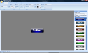
Okay so, enough small talk. Lets get to the meat of this review. This is what the program looks like:
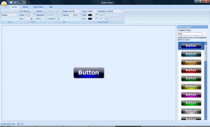
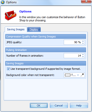
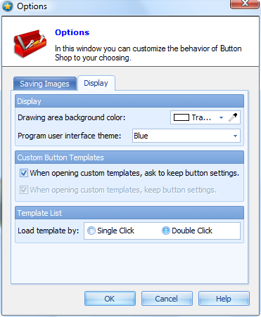
As you can see, the interface of this program resembles Microsoft Office 07 – the ribbon is a rip off from Microsoft. Usually I get pissed when programs just copy Microsoft color schemes/look, but in all honesty, this program pulls it off well – I cannot complain. What I can complain about, however, is the gray that surrounds the button. I don’t know about you, but I personally dislike that gray. So, first thing I did, and I suggest you do to the same, is go to Help -> Options -> Display -> Drawing area background color. Chose ‘transparent’ from the drop down menu. Now the program looks like this:
Such a nice improvement, don’t you think? Anyway, in order to create a button you must use a template. I wish the developer had added in an option to be able to start off from a new blank button, but you cannot. Everytime you create a ‘New’ button (Ctrl + N or click the “New” button up top), you will get the default template look. The default template look is the one you see in the above screenshot. This is more of a annoyance then a problem because you are able to fully customize your button so in the end your button does not have to look anything like the template you used. So, you chose/change your template from the menu on the right labeled “Button Templates”. Just find the one you desire, and double click on it. It will replace the button you currently have up with the new template you chose. The templates are broken up into groups. The groups really don’t mean much except that they help categorize the templates. There are tons of templates to chose from – I cannot possibly describe them all, you will have to look through them yourself.
Okay so you have chosen your template, and now you are ready to customize your button. Well you customize your button via the options available in the ribbon up top. The ribbon up top has 4 tabs: Button, Effects, Edge Effects, and Help.
Button:
- “Text” – From here you can change what text is displayed on your button. Click on the drop down menu. Change whatever is in there to whatever you liked. Whatever you enter in this drop down menu will be displayed your button.
- “Font” – From here you get to format the text you have on your button. You chose the font type, the color, and the size. You can add/remove shadow from your text (“Shadow”). You can change where the text is located on your button (dead center, left, right, top-left, etc. or any custom position) from “Alignment”. Lastly, from “More” you are able to bold, italicize, underline or add an outter outline to your text. You can also rotate your text from “More”.
- “Size” – From here you can change the size/shape of your button. By default, “Autosize” is checked. The advantage of keeping autosize checked is that the button will be automatically resized to fit your text. If you uncheck “Autosize” you can manually chose the size of your button in pixels (width/height). From “Shape” you can chose your button to be “Round”, “Tab-up”, or “Tab-down”. Round is kind of a misnomer because you can make a rectangle/square button. What round actually means is that all 4 corners have the same properties, meaning that if one corner is pointed, all will be pointed, etc.. Tab-up, however, has the top two corners as sharing the same properties and the bottom two being pointed like in a rectangle and unchangeable. Tab-down, is the opposite of tab-up. The value in “Corner” allows you to chose how pointed the corners of your button are. If your shape is “Round” a change in the “Corner” percentage will be reflected in all 4 corners. In tab-up the top two corners will be effected by a change and tab-down the bottom two. 0% will make your corners completely flat and your button will look like a rectangle/square. 100% will make your corners completely round and your button will look like a oval/circle. Any value in between will change the look of the corners accordingly. Unfortunately, these are the only shapes your buttons can be. There is no deviating from these shapes – no buttons with xrazy ragid borders for example.
This is what a “Round” button with “Corner” 100% looks like:
This is a “Tab-up” button with “Corner” 100%:
This is a “Tab-down” button with “Corner” 100%:
- “Color/Texture” – From here you can mess around with how the background of your button looks like. You can have a color scheme, or you can add your own custom image. To have a color scheme, be sure “Colors” is chosen in “Type”. “Direction” allows you to change how your color scheme looks. If “Vertical” is chosen, the button will be divided into a top and bottom half (not literally) – the color in “Start” will be displayed in the top half while the color in “End” will be displayed in the bottom half. two colors in “Start” and “End” will be displayed. Each “Direction” will change how the color is displayed – each will correspond to the colors in “Start” and “End”. You can chose Verticle, Horizontal, Vertical-Center, Horizontal-Center, Diagonal-Left, or Diagonal-Right as “Direction(s)”. If you would rather have your background be an image as oppose to a color scheme, click on the drop down menu for “Type” and chose “Texture”. Then click the “…” button located next to “Image” and browse to the image you want as your background. Be sure that the image you chose is the correct size for the button, because the image will not be automatically resized to fit the button. If the image is too big only a section of the image will be visable. If the image is too small, it will be “Tiled”. From “Tiled” you get to control how the image is repeated if it is too small to fit the whole button. “Tile” will just tile the image – placing one image one after another. “Tile Flip X” places one image normally, then flips the next image horizontally and places it to the left of the first. The third image is placed normally, and the fourth is again flipped horizontally. The pattern continues like that. “Tile Flip Y” does the first row of images normally, but then it flips vertically the second row of images. The third is normal, fourth is flipped, etc. “Tile Flip XY” combines the effect of both “Tile Flip X” and “Tile Flip Y”. Regardless of if you chose color scheme or texture image, you may notice that for most templates, there is a color in the middle of the button that is not changed, such as the blue you see in the above screenshots. This is the ‘light effect’ – more on this later.
Effects:
- “Gloss Style” – in the above screenshots of the buttons, do you see the top half is kind of ‘shiny’? That is the gloss effect. From “Gloss Style” you get to change how that effect looks – or you can turn it off (Type -> None). From “Type”, you chose from different types of gloss effects:
Aqua
Sunrise
Sunset
Vista
Wave
XP
“Color” just changes the color of the gloss effect (all the screenshots above are white). Lastly, “Visibility” changes the opacity of the gloss effect – the higher the value the more ‘visible’ the effect will be. All the above screenshots are at 67% visibility.
- “Button Icon” – this option allows you to add an image on top of your button. This is different from the Texture image because this button icon is displayed on top of the background (color scheme or texture) but under the text. The image that you chose for this is resized to fit the button if it is too big. If it is smaller then the button size, the image is not “tiled” like texture image was – it is just displayed once. Just click the “…” button to browse for the right image. If you decide you do not like the image, hit “X” to remove it. You can change the opactiy of the button icon by changing the “Visibility” value. “More” allows you to chose where on the button you want the image to be located (center, left, right, etc.).
- “Light effect” – you see the blue in the above screenshots? That is the light effect. If I were to turn off the light effect (uncheck “Show”), the button would go from looking like this:
To this:
That being said, you can change the color of this light effect from “Color”. From “More” you can change the “Visibility” (opacity) of the light effect, and where on the button it is located, horizontally (0% is left) and vertically (0% is top). In the above screenshot, the light effect is at 100% visibility, 50% horizontal position, 100% vertical position.
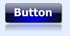
- “Mirror Effect” – adds a reflection of the button underneath it:
“Visibility”, as always, allows you to change the opacity of this reflection (the above SS has it at 40%). “Distance” is the distance between the reflection and the actual button. The distance in the above screenshot is 0.
- “Options” – from here you can do a few things. For one, you can ‘animate’ the image – click “Pulsing Preview”. This is what your button looks like if it is being ‘pulsed’:
“Button Shadow” allows you to turn on/off the shadow of the button. You can also change the color of the shadow, the visibility, and the location of the shadow in relation to the button (X,Y coordinates).
Button with black, 100% Visibility, 6 X, 6 Y shadow:
Button with no shadow:
“Grayscale” just turns your button into a grayscale image – no colors. “Grayscale” button:
Edge Effects:
- “Glow” – adds a “glow” to your button. “Color” allows you to chose the color of the glow, and “Size” is the size of the glow.
Button with red glow, size 10:
- “Inner Stroke” – adds a colored line to the inside of your border at the edges. “Color” allows you to chose the color of this line, and size allows you to chose the size of this line.
Button with no inner stroke:
Button with yellow line size 2:
- “Outer Stroke” – does the same thing as inner stroke but to the outside of the button instead of the inside.
Button with no outer stroke:
Button with black size 2 outer stroke:
This is what a button looks like with yellow size 2 inner stroke, and black size 2 outer stroke:
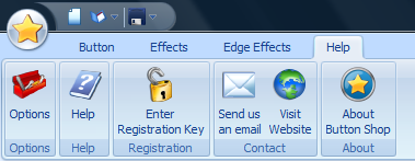
Help:
- “Options”
Okay, so you have customized and created your button to your liking. What now?
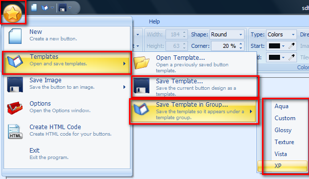
Well if you like how your button looks and you know you will like to use the same look in the future, you can turn your button into a template. You can either save the template as a single file on your computer (a single file that you could e-mail or send to other people), or you can add the template into one of the groups that you can access from the “Button Templates” menu on the right. To do this, click on the circle with a yellow star button that is located in the top left of the program window. Then go to Templates. To save the template as a single file, go to “Save Template…”. To save the template and add it to one of the groups that you can chose from “Button Templates”, go to “Save Template in Group…” and chose your group.
It is worthwhile to note here that you can create your own template groups if you want. Just press the “…” button under the “Button Templates” menu.
Okay you saved your button as a template. Or maybe you didn’t. Doesn’t matter. What matters is that now you want to be able to actually use your button. So now you must save your button as an image file. Click on the circle with the yellow star again. Go to Save Image. If you turned on “Pulse Preview” and would like your button to look like that, chose “Save Pulsing Image As…”; otherwise, chose “Save Image As…”:
Be sure to save the pulsing Image as an Animated .GIF unless you want individual images of each frame of your button. You can save your images in all popular image formats.
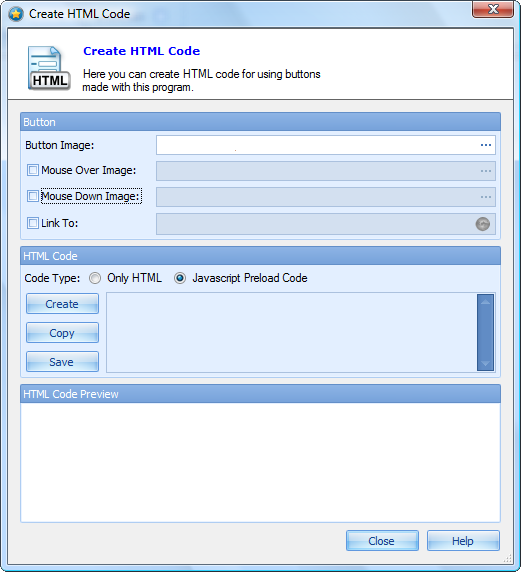
After you have saved your button, there is one more thing you can do. You can generate HTML code so you can insert the button directly onto your website. If you know how to generate the HTML code already, there is no need for you to mess with this. But if you don’t, this program will generate sufficient HTML code for you. Again click on the circle with the yellow star. Then go to “Create HTML Code”. You will see this window:
From “Button Image” you must browse your computer and find the image of the button that you want to use. You should have saved your button as an image prior to doing this HTML coding. You can make it so that a different image appears if someone mouses over your button – just check “Mouse Over Image” and browse to the image you would like to appear. You can do the same when someone clicks on the button – check “Mouse Down Image” and browse to the image you would like to appear. You can also have the program code in for you the URL that the button would be linked to – chekc “Link to” and type in the URL. Mouse over image, mouse down image, and Link to are all optional – you do not have to use them. After you are done with that, you have the option of generating just HTML code, or HTML code with Javascript. For most people, HTML code should work just fine. After you have decided that hit “Create”. You will be able to preview what your button will look like at the very bottom. Scroll over it and click on it to make sure it works properly. Then you can either copy the code and insert it directly onto your website (hit “Copy”) or save the code into a HTML file onto your computer (hit “Save”). Be sure that when you are putting the code onto your website, you correct the locations of the image files.
That describes this whole program. Long @$$ review, geez. I have a few problems with this program, some of which I have mentioned above:
- You cannot start off with a new blank button. You must use a template. As I mentioned above, since you can customize each template/button however you please, in the end this really doesn’t matter. But it is annoying.
- You cannot create a custom texture/image with this program. You have to create a texture or image with an external image editor (or download a texture/image). You can only import the texture/image.
- You should have more control over the “pulse” animation (be able to change visibility, effect, color, etc.).
- You are limited in the shape of your button. There are predifined settings that you must stay within. You can only have buttons that fall in between a rectangle/square and a oval/circle or a tab up/tab down button. Nothing else – no custom borders, no custom shapes, no nothing.
- It would be nice if you did not have to save the button as an image first in order to create the HTML code. Of course in the process of creating HTML code, the button itself would have to be saved automatically in order for it to work properly but it could save a step for some people who want to go directly to adding the button to their website. Having both options of going directly from Button -> HTML or Save Button then use the HTML generator would be a plus to this program.
Free Alternatives:
Use any image editor
You can create buttons with any image editor, such as Paint.net or GIMP. It will not be as ‘easy’ because you will have to start off from scratch, but you will have more control over your button. You will also not be able to generate HTML code for your buttons, but that can easily be done with some research on google.
Cooltext.com (thx giovanni)
You will be able to create really nice buttons from here. You don’t have to download anything and it is all pretty easy to use. However, you will not be able to add your own custom image to it.
PMnet Verdict: Button Shop 3 is a good program for making buttons in a quick manner. The buttons that are created are pretty nice and the great amount of customization you have over the buttons is great. The ability to generate HTML code is also nice for beginners. However, the limits on the shape of the button is a big con because some people might not want the rectangle, oval, or anything in between shaped button. Button Shop 3 will not be very useful to professionals who like to be more creative then this program allows, but for beginners this is a nice program. You decide for yourself if it is a keeper or not for you.
[/rssless]

 Email article
