 Email article
Mobile devices don’t display websites entirely the same as desktop browsers. You can open Web pages in mobile views within desktop browsers with Site to Panel. That’s a Firefox add-on that opens a page in mobile view from the toolbar.
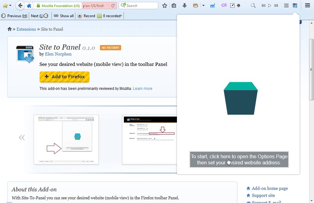
Install the add-on from the Site to Panel page. It adds a Site to Panel button to toolbar. Click that button to open the panel as below.
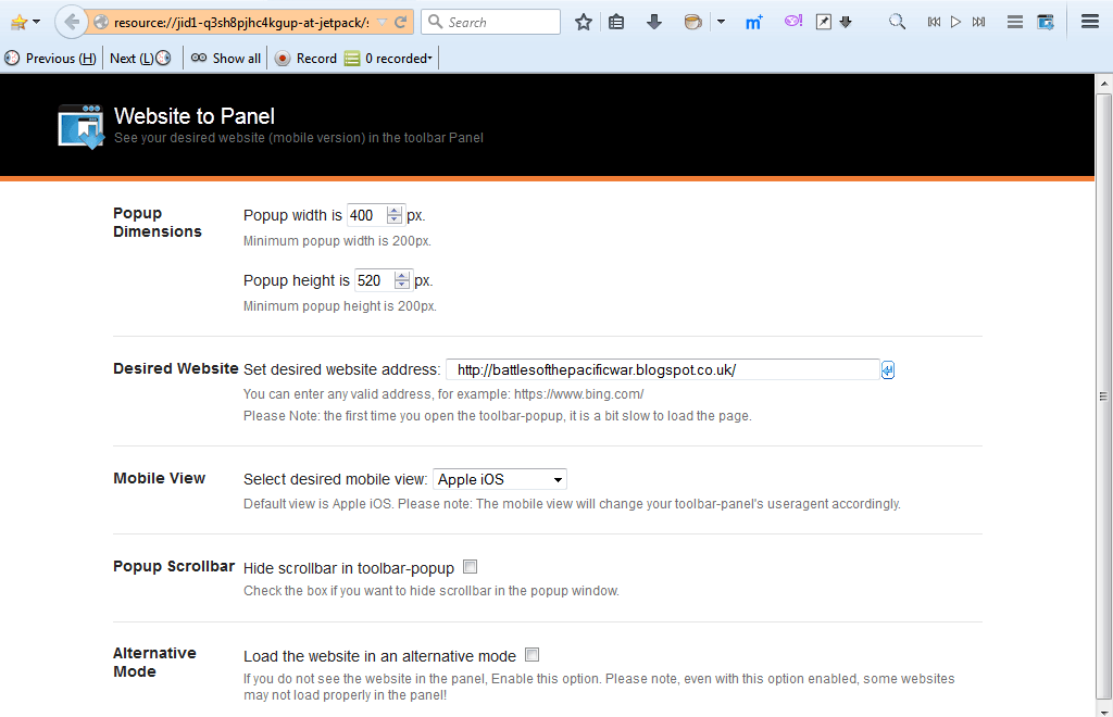
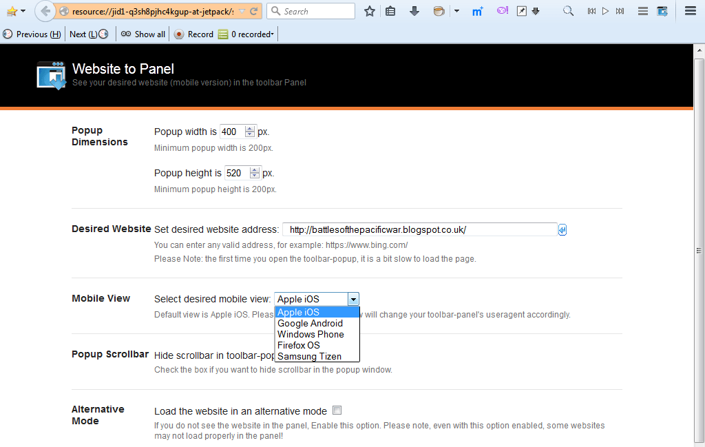
Press the button at the bottom of the panel to open the settings page. You can also open that page by pressing the Options button beside Site to Panel on Firefox’s Add-on page. The page includes a text box in which you can enter a URL for the panel to open. Note that an address such as www.google.com won’t open in the panel, so copy the full URL from the website with Ctrl + C and Ctrl + V hotkeys.
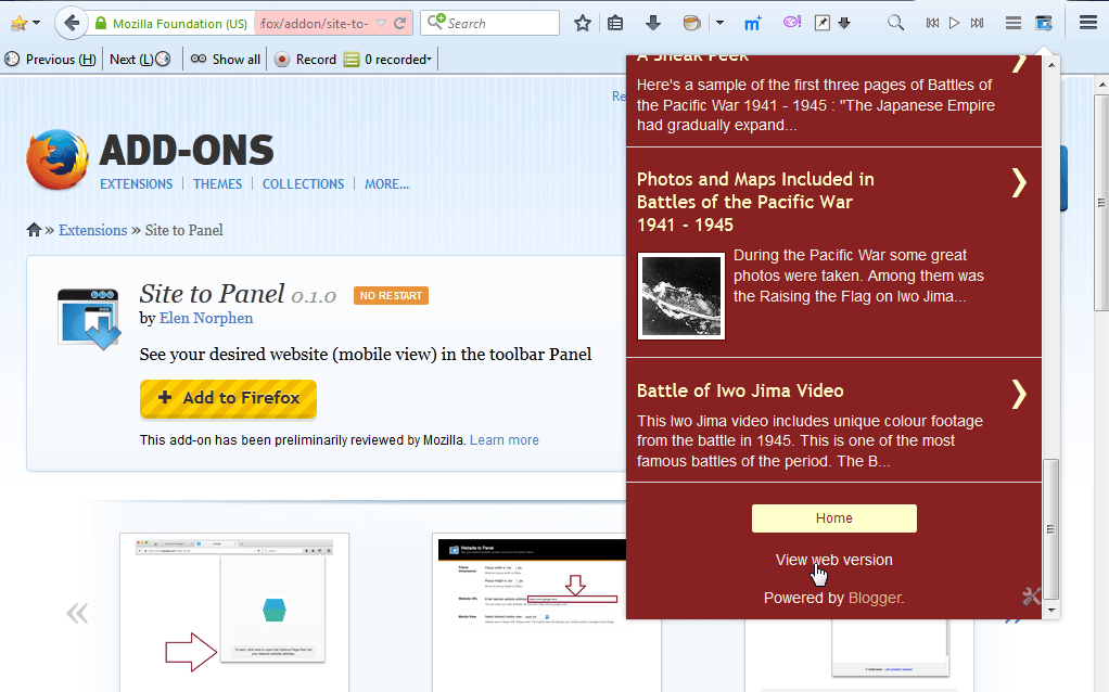
Now press the Site to Panel button on the toolbar to open the page entered in URL text box. It will open as shown in the snapshot below. It will open the page as it would be displayed in a mobile device such as Apple iOS. You might find the bottom of the page in the panel includes a View web version option.
To adjust the panel’s dimensions, return to the settings page. At the top of the page you can enter alternative numbers in the pop-up dimension boxes. The minimum dimension values are 200 x 200.
Note you can also select five alternative mobile views. Click the mobile view drop-down list as below. There you can select iOS, Android, Tizen and Firefox OS modes.
So now you can open website pages in a mobile view mode with your desktop browser. Plus the add-on also gives you a way to open another page in the same Firefox window. You’ll find additional details at the Site to Panel website.