dotTech is back

November 21, 2010 105 Email article | Print article

So, as I am sure all dotTechies have noticed, I have not posted on dotTech for the past two months. Why? Simply because I was too busy with life (life outside dotTech), and couldn’t deal with dotTech. I know I should have given a heads up instead of just disappearing, but I never really planned on just disappearing. It was more of a gradual “oh I will post something soon” and before I knew it “soon” become two months. For that I do apologize. Now, however, I am back and looking to make a few changes to dotTech.

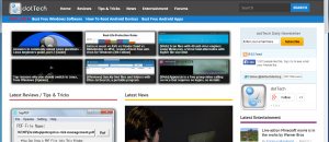
First of all, I am sure everyone noticed dotTech has a new look. There are three main reasons behind the new look:

  • After the two month break, I wanted to start “fresh”.
  • The previous theme I had for dotTech was poorly coded, and recently I have had a craving for a minimalist look.
  • dotTech has started its third year online — what better way to celebrate than change looks?

That said, I would like some feedback on this new look. Hate it? Love it? Want something changed? Found bugs? Please post in the comments below!

Second order of business is changing how dotTech functions. While I was on my “break”, I realized that the existence of dotTech depends very heavily on me. Yes, I know I am the founder/owner/care-taker/etc. so being the core pillar holding up dotTech is expected. But I would like dotTech to be more community centric, with multiple authors and active participation from dotTechies. So, in this regard I will be posting information soon about hiring authors for dotTech (this time authors – all regular authors – will be paid, although the pay will be very,very little since revenue is very, very little) and am devising a plan to enhance community participation.

Thirdly, because of the lack of activity in the past two months, the traffic ranks for dotTech has fallen. This really hurts dotTech’s capabilities to get freebies like we have in the past. So I humbly request all dotTechies to try to make regular visits to dotTech so we can pull our ranks back up, enabling more excellent freebies to come our way.

Fourthly, I have removed the sidebar from the forums to make more width for the forum. Please provide feedback on this change.

Lastly, the status of Giveaway of the Day reviews is up in the air. Truly, I have found myself no longer enjoying GOTD reviews, so I am not too sure if I will continue on them. However, I will be looking to hire a regular GOTD reviewer, so if you are interested in the job let me know.

Let’s build this website together back to its former glory!

Feel free to flame me in the comments below – I deserve it.

105 Comments »

  1. John November 23, 2010 at 4:50 AM (comment permalink) -

    Welcome back Ashraf!.   I missed your reviews.

    76
  2. kimotheraphy November 23, 2010 at 6:39 AM (comment permalink) -

    Your new website design is a bit too minimalistice for me and makes be feel a bit depressed.. some color would be nice.
    I was one of those who initially read your reviews in Gaotd with suspicion but have since been won over by your in-depth reviews, dotTech Exclusive giveaways, but most of all, by your friendly, cute, funny personality and witty responses to comments. I think your personality is what MAKES this website and it is important that you continue to show up on this website. You could write something short and informative on any tech-related topic and we, your readers will take it from there, contributing something from our own experiences. It is always interesting to read what others have experienced with a particular gadget, software, etc.
    One more thing, it would be all too natural to feel run-down by the negative comments everytime you post a review in Gaotd. Forgive the detractors for they know not the good you are providing to so many who likes what you do.

    77
  3. Sunny November 23, 2010 at 8:56 AM (comment permalink) -

    Ah! The prodigal son returns at last. Good to have you back home. You have been much missed.
    Regarding your site revamp: I have four main priorities with site authoring.
    1) The pages need to load fast. 
    2) The pages shouldn’t be cluttered. 
    3) The pages should be optimised to work in all major resolutions from 800 x 600 up and should be ‘stretchy/elastic’ for those who have to view at low resolutions and large font sizes.
    4)  The design should be geared to Usability, Functionality, Accessibility and Attractiveness.
    Having said all that, I’m afraid that these days I don’t view a site as the designer intended it to be viewed. Because of sight/vision issues I customise most of my browsers so that the pages have a coloured background and if possible a non-serifed text, such as Arial. Firefox is usually a black page with light blue text which serves my eyes well. Green Browser I gave a grey-green ‘easy on the eyes’ background, and so on.
    My eyes can’t tolerate white backgrounds, but for this occasion I pulled up Iron (which is the one browser that has resisted my attempts at customisation)  so that I could view your website changes. 
    Simplicity is good, starkness not so. For me it was much too stark. There is too much white with too little colour to break up the glare of all that whiteness.
    Other than that the layout looks good, though there is one problem and that’s the lack of a proper heading at the top of the pages.
    I’m not sure if it’s the Iron browser I’m viewing it in, or if that’s the way you designed it, but the top of the page is much too busy with text links, text adverts etc. Ideally it should be a place where your site announces to the world Who it is and What its purpose is.
    I think it needs ‘weight’ at the top of the page, not necessarily a banner, but something standout that tells me instantly I’m at Dottech, and why I’m there. This is really important for visitors who may be dashing around from site to site, short of time as many of us are these days. Your site needs to impress and imprint itself on visitor’s eyeballs and in their minds whether they are just passing by, or staying for a while.
    As I recall, images or graphic links right at the top of a page lower search engine page ranking, so why not something in large heavy text (perhaps coloured), like “DOTTECH – Your Site for Software, Reviews & Discussion”, or something similar. At the moment I can see one lonely spot of colour and that’s the logo  (a clever one), but I’d like to see the word Dottech loud and clear and eye-catching at the top also. Loud enough, without being too strident, to arrest the eye and remain in people’s minds after their visit.
    Regarding delegation to others, I endorse what others have said: Be vigilant as to the quality of any work, writing, reviews that others put up on the site. Don’t let the standard get eroded when you’re not around. I think you’d do best to gradually, incrementally step back while others come forward and a gentle, almost imperceptible transition time is best in my view. 
    It would be great if you could still write full GOTD reviews every so often, especially when there’s a standout program offered.  They’ve always been beautifully presented and welcomed and appreciated by many at GOTD.  And I think ultimately a 50% involvement at dottech by your good self would be sufficient to keep the punters happy, especially if other strong talent of the standard of Locutus for example were also regularly contributing.
    I would gladly offer myself as a contributor but have insufficient expertise to be of any value.  But I will stop by more often in the future to help restore rankings.
    You’ve built up a great site and we, who’ve gained so much from it, need to help maintain it in whatever ways we can, so that you can have some chance to fulfil other areas of your life.
    Hope this has been of some help  :)


    78
  4. Emrys November 23, 2010 at 9:20 AM (comment permalink) -

    I’m so glad you are back. As crazy as the world is, you scared the hell out of me, for one. Looking fwd to your new posts. Be well, God willing.

    79
  5. Nisanth P November 23, 2010 at 9:24 AM (comment permalink) -

    Welcome back Ashraf,
    nice look for dottech.
    Pls dont stop  GOTD review, I was looking here for the review before going to GOTD website. It’s truly detailed review. If no time for full detailed review, try to post quick thots.
     
    All the best for dottech.

    80
  6. dwagenberg November 23, 2010 at 11:31 AM (comment permalink) -

    Welcome back.  I depend on your reviews of GOTD; in fact your reviews are the ones I trust without question.
    I like the new look.

    81
  7. Mike November 23, 2010 at 1:29 PM (comment permalink) -

    Welcome Back.  Glad to see jail hasn’t ruined you.As for GIVEAWAY who cares??

    82
  8. Samuel November 23, 2010 at 7:05 PM (comment permalink) -

    Talk about irony. I also got side track with “real life” and couldn’t work on dotTech stuff, let alone check on the site. I come back today and I was about ready to email you about something being wrong with the site’s look! Well welcome back budy! I guess it’s time to get the writing machine back online…IE9 seems ripe I think!

    83
  9. Samuel November 23, 2010 at 7:22 PM (comment permalink) -

    On a side note, the new site doesn’t display correctly in IE9, though I admit the only thing I can prove is that the search button is bellow the text box for it. There may be other problem’s but I can’t tell since I’m not sure what the sites suppose to look like!

    84
  10. Rob (Down Under) November 23, 2010 at 7:34 PM (comment permalink) -

    @Samuel:
    I am using FF, and it is slightly weird.
    I put it down to some designer somewhere assuming that we all have widescreen monitors. (And we don’t)

    85
  11. Samuel November 23, 2010 at 7:37 PM (comment permalink) -

    @Rob (Down Under): That’s weird. Well I DO have a wide screen monitor and it’s off, hmmm….

    86
  12. NoWankersHere November 23, 2010 at 7:44 PM (comment permalink) -

    @amozai: Well said, mate – huzzah! White, black, or what say, all are welcome here! It is more like we are part of the United [Ashraf] Kingdom. This is probably the most civilized, respectful, and straightforward site I know. It is a great pleasure to see it back!

    87
  13. Ashraf November 23, 2010 at 8:03 PM (comment permalink) -
    Mr. Boss

    @Samuel: I looked at it in IE9 and yes the search box is the only issue. However, it seems to be an IE9 thing only… I visited dotTech on IE7 earlier today and everything was perfect.

    @Rob (Down Under): You are having the same serach box issue in FF? What is your monitor resolution, if you don’t mind me asking.

    88
  14. Ashraf November 23, 2010 at 8:06 PM (comment permalink) -
    Mr. Boss

    BTW listening to some of the feedback given above, I made the background of dotTech to be a more grayish white than pure white. What do you guys think?

    89
  15. Dru November 23, 2010 at 10:40 PM (comment permalink) -

    Hello Ashraf, I was reading the comments and agreeing that the page is too bright, when I see that you’ve already dimmed it some. I’ll of course defer to popular opinion, I’m just thankful this site is here! I stumbled across it from GOTD sometime in the last 6 months. FWIW, I would prefer something a bit less bright and maybe in a tan hue.

    I do miss the “popular” links that appeared on the right. I try to stay informed of the best security/anti-malware solutions, and data backup solutions, and your articles have been so helpful!

    Also, in both IE8 and FF 3.6.12 I don’t get drop-downs. Just a line of words. The links work, that’s how I found out they are supposed to be drop-downs (the landing pages told me so). It’s probably me since there isn’t much mention of drop-downs not working, but if anyone has ideas…

    Thank you. It’s great for me to have you back, I’m glad for you that you took some time off. Congratulations on 3 years! It’s quite remarkable, really, what we all have here. Thank you.

    90
  16. Dru November 23, 2010 at 10:49 PM (comment permalink) -

    Does the page navigation at the bottom of the home page work for everyone else? No matter which page I click on, even tho the URL changes, the resulting page is the same, the same as the home/main page. Tried it in IE8 and FF 3.6.12, same for both.

    91
  17. Ashraf November 23, 2010 at 11:06 PM (comment permalink) -
    Mr. Boss

    @Dru: Thanks :D

    @Dru: No, you are not the only one — they are broken. That actually is the biggest bug which I am working on getting fixed.

    92
  18. Ashraf November 23, 2010 at 11:15 PM (comment permalink) -
    Mr. Boss

    @Dru: Please check now — after much brainstorming I actually just fixed it :-).

    93
  19. tim November 24, 2010 at 5:54 AM (comment permalink) -

    Was wondering what happened to you the other day—I noticed your post on today’s GOTD and followed the links to here—apparently I’m not getting your emails anymore either. If I somehow fell off your list, then sign me back up please.

    94
  20. Ashraf November 24, 2010 at 6:32 AM (comment permalink) -
    Mr. Boss

    @tim: The e-mails notifications are a problem right now because of my shared hosting — I am only allowed to send out a specific amount of e-mails an hour which is significantly less than what I need to send out. Currently I am waiting for my dedicated server to be provisioned (in fact sending out e-mails is the only reason I am switching to a dedicated server because otherwise this shared hosting perform just fine right now), after which everything should be getting e-mails as normal. Sorry about that.

    95
  21. David Roper November 24, 2010 at 6:55 AM (comment permalink) -

    Idea! What about Ashraf selling a “pitpass” or “canvas pass” for $20 which would give the patron the right to see behind the scenes activities or even turn on a personal background color which it seems everyone wants.

    That way we could “feel” good about donating to the dotTech cause without deciding how much. The pitpass would last 6 months or a year, whatever…

    When the pitpass expires, the background color reverts to stark white again, reminding user to ‘pony up” cash again.

    Just saying…

    96
  22. Ashraf November 24, 2010 at 6:57 AM (comment permalink) -
    Mr. Boss

    @David Roper: LOL! Hold users’ eye comfort hostage.

    97
  23. LOL November 24, 2010 at 7:10 AM (comment permalink) -

    Welcome Back! I do not like the new look :)

    98
  24. Dru November 24, 2010 at 7:21 AM (comment permalink) -

    @Ashraf: Great job! The nav buttons work. I tried both page links and the guillemets (angle quotes). I know when I figure out something how satisfying it is… enjoy this victory ;-)

    The page is a bit easier on my eyes… probably because it’s now morning with the am sun struggling to burst through my blinds over my shoulder. If it’s agreeable with you, I think I might still prefer a softer hued darker bakground… not unlike before?

    Have a great day!

    99
  25. Ashraf November 24, 2010 at 7:34 AM (comment permalink) -
    Mr. Boss

    @Dru: Thanks =D. I will look into a darker background, but the general feedback I have received so far is that this grayish white is fairly good.

    That said, though, I may make the previous theme available for users to change to and/or change this theme out for a more colorful one if the backlash is strong enough =P However, I would prefer to keep this theme (I really like it) and it is easier to maintain one theme than multiple ones.

    100

Leave A Response »