dotTech Redesign: Second time is the charm

November 29, 2010 59 Email article | Print article

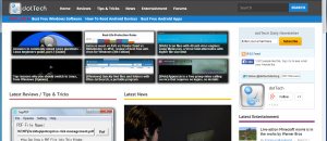
Hey look – it’s a bird, it’s a plane… no, it’s the new dotTech! Last week I introduced a minimalist black-and-white design of dotTech. However, many dotTechies wanted something with color. So based upon the feedback I received, I have changed the look of dotTech yet again. The hardest part about this new redesign was advertisement placement because the minimalist design had excellent advertisement placement. However, in the end, I think I got it right but I may be moving the ads around. After all, someone has got to pay the bills so might as well let Google do it.

Please provide feedback and let me know if there are any bugs in the new design.

Had you thought I didn’t listen to what you said… :-D

59 Comments »

  1. AlanR November 29, 2010 at 9:58 PM (comment permalink) -

    @jimx29: Thanks for the tip – will give it a try to see if it helps improve readability.

    Sorry Ashraf, your new colour scheme only showed up today and I am having difficulty reading banners etc. due to the combinations you have used – us poor people having colour vision deviations always seem to be overlooked in such matters…. sob. :((

    26
  2. Paulo Leme November 29, 2010 at 10:00 PM (comment permalink) -

    Great look, Ashraf.

    27
  3. Ashraf November 29, 2010 at 10:01 PM (comment permalink) -
    Mr. Boss

    @AlanR: :-( I am sorry, I can’t please everyone :-( “The greatest good for the greatest number.”

    28
  4. pach November 29, 2010 at 11:16 PM (comment permalink) -

    Hi Ashraf
    So glad you are back. Really appreciate what you do.
    Take care,
    pach

    FYI: This warning message below was on your clean blog policy page. “http://dottech.org/clean-blog-policy”

    Warning: include(/home/dottech/public_html/wp-content/themes/thematic/topad.php) [function.include]: failed to open stream: No such file or directory in /home/dottech/public_html/wp-content/themes/commune/functions.php on line 425

    Warning: include() [function.include]: Failed opening ‘/home/dottech/public_html/wp-content/themes/thematic/topad.php’ for inclusion (include_path=’.:/usr/lib/php:/usr/local/lib/php’) in /home/dottech/public_html/wp-content/themes/commune/functions.php on line 425

    29
  5. Tortuga November 29, 2010 at 11:17 PM (comment permalink) -

    Dear Ash

    YAEHHHH !!!! Very Very Good!
    I like the new design, I like the new features – very clean & professional.
    The different sections on the right side column are well identified w easy access.

    Also like the changes made to the comments w the name/date/time of the poster on the side, it will be easier to refer to when needed.

    I do have 3 suggestions, all regarding the comments section:
    1) PLEASE PLEASE try to give numbers to the comments. Though the new changes are an improvement, usually we write down “comment #3,6,11″ and unless counting down the comment boxes each time, its a bit difficult to retrace which comments we are referring to in our notes.
    2) Adding a few tools to help out writing comments easier (maybe just a few buttons, for Bold, Italic, Underline would be sufficient).
    3) And the least important suggestion: Alternating 2 shades of gray on the comment boxes would be pretty.

    Overall, everything is quite nice. Bravo!

    Peace

    30
  6. Tortuga November 29, 2010 at 11:23 PM (comment permalink) -

    Ohhh,
    Just realized you removed the 10mn «Editing» feature after the comment was posted … :( !!!
    Are you bringing it back??
    If at all possible, a 20 or 30mn window would be even better :*)

    Have a great day!

    31
  7. John G November 29, 2010 at 11:31 PM (comment permalink) -

    This looks great. However, anything you put up would be just fine with me. I’m more focused on the information rather than the aesthetics. I’m very happy you have so many positive responses here from your readers. You’ve done and I’m sure will continue to provide a great service here.

    32
  8. Ashraf November 29, 2010 at 11:41 PM (comment permalink) -
    Mr. Boss

    @Tortuga: I didn’t remove it. Is the editing feature not working?

    @Tortuga: I will be adding numbers soon, no worries. And the comments already alternative gray, don’t they?

    33
  9. Michael Brazil November 29, 2010 at 11:42 PM (comment permalink) -

    @Wheezer:
    I agree, Wheezer. On my monitor, the entire menu bar at the very top of the page is almost invisible until you mouse over one of the links/buttons. The ones that don’t “light up” when you mouse over them are nearly impossible to read.

    Everything else looks great!

    34
  10. Ashraf November 29, 2010 at 11:43 PM (comment permalink) -
    Mr. Boss

    @Michael Brazil: I am working on changing the sidebar text to black instead of gray.

    35
  11. Ashraf November 30, 2010 at 12:06 AM (comment permalink) -
    Mr. Boss

    @Michael Brazil: Wait did you mean you can’t see the sidebar or the topbar? If the top, what exactly can’t u see? The one in brown or the one in white?

    36
  12. mupton November 30, 2010 at 12:33 AM (comment permalink) -

    Works for Me ,Ash
    Bet ya came across that No/sqint add on In your battle with the web mongers,,eh
    mupton

    37
  13. mupton November 30, 2010 at 12:41 AM (comment permalink) -

    just noticed Michael brazil,,,,,I have both B&W bars,running Fox 3.6.12 with G search on xp dbl ckd with win 7 on laptop looks good with the new Beta 9 on I.E

    38
  14. jumbi November 30, 2010 at 2:14 AM (comment permalink) -
  15. MarDel November 30, 2010 at 2:31 AM (comment permalink) -

    Site is great and it is ever so good to have you back as I depend on your views and comments. Thanks!

    40
  16. Tortuga November 30, 2010 at 3:00 AM (comment permalink) -

    Hi Ash

    Thanks for the reply.

    1) I dont have the «Edit» feature
    2) Thanks for adding the «Number» feature on a near future

    NOTE:
    I’ve been ridding FF4.0b7 these past few days… Strange things happening eg addons automagically disappearing, settings going berserk, sites a bit off.
    So, I’ll add the gray not showing & the «Edit» feature disappearing on the beta’s fault.
    Tomorrow I’ll be switching to FF 3.7 – I’ll let you know if all is right or not.

    ***********
    ON THE OTHER HAND…
    Some time ago you’ve asked us to unblock AdBlock on the site. Which I’ve done since.
    But earlier today you mentioned Google Adds … And just realized I haven’t seen any … !!! !!!
    WHERE are they? I can NOT see any Adds anywhere!!
    And believe me I’ve been looking!

    Peace

    41
  17. kniht November 30, 2010 at 3:35 AM (comment permalink) -

    Very professional. A lot ‘warmer’ look than the old B&W. The new look is inviting.

    42
  18. krajicek November 30, 2010 at 4:09 AM (comment permalink) -

    liked the clean look of white-ish version of the site. however this one also looks oke
    however – one small glitch:
    google ads overlap left half of the main article on Home page (the black one about Outpost) – i’m on FF 2.0.0.20
    can that be sorted please
    thanks in advance
    kr

    43
  19. IndoMK November 30, 2010 at 4:20 AM (comment permalink) -

    Hmm… I like this look much better than the other one! I don’t keep thinking that my browser somehow failed to completely load the page.

    My two bits worth of opinion would be that the “Important Links” and “Recent Comments” header boxes (bottom bar) are a bit bright on the eyes. It’s really hard to focus without squinting or something. Maybe a darker color blue for the boxes, and black for the divider lines?

    44
  20. a simple happy man November 30, 2010 at 5:12 AM (comment permalink) -

    Good job Ashraf,

    Now I see what you have been doing staying up late into the wee small hours of the mornings doing

    45
  21. Mags November 30, 2010 at 6:07 AM (comment permalink) -

    MUCH better. It is now more focused on what is important. With the all white, one didn’t really know where to look first.

    The layout is still similar, the added colour does make that all important difference. As for the ads, I think they are ok where they now. They are not the main focal point as they were with the all white and black.

    A thumbs up from me on this one.

    46
  22. Dave November 30, 2010 at 9:04 AM (comment permalink) -

    The color highlights and alternating grey in the comment boxes are a big improvement over the previous minimalist design. It’s much easier to read and to quickly identify the different sections. Thank you.

    47
  23. Mike Markwick November 30, 2010 at 11:53 AM (comment permalink) -

    I like it very much, also your comments on software are more than anybody could ask for so informative, I would be lost without the information you provide. And yes the new look is perfect.

    48
  24. Malcolm Pritchard November 30, 2010 at 1:44 PM (comment permalink) -

    Good look ,and Good Luck! Welcome back,Ashraf.

    49
  25. alabious1@yahoo.co.u November 30, 2010 at 2:08 PM (comment permalink) -

    I am new to this site but i likes this more better than the former one. keep it up.

    50

Leave A Response »