Google has a new, all blue favicon — did you notice?

August 15, 2012 9 Email article | Print article

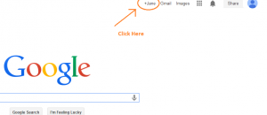
Favicons are one of those small niceties of the Internet; they allow users to quickly visually recognize a website without having to read any text, such as when navigating between multiple tabs or bookmarks. Google, one of the most popular (if not the most popular) digital destination on Earth, has just recently changed its favicon. Did you notice?

Google’s latest favicon, which is its fourth favicon in its online history, comes in all blue with the letter “g” featured. It isn’t entirely clear why Google picked blue this time around but we know the “g” is used because of its similarity to the infinite symbol, which in turn relates to Google’s play-on-words of googol, a mathematical term used to describe a number that has 100 zeroes at the end of it (aka a huge number). Interestingly enough, this new favicon is a flashback to Google’s second favicon that was introduced in 2008 (the one before the just-deprecated favicon) — the new, all blue favicon has the same “g” the favicon of 2008 had.

If you can’t see the new favicon yet, try any of the following:

  • Hit Shift + F5 on your keyboard when on Google’s website.
  • Go to http://google.com/favicon.ico, hit Shift + F5 on your keyboard, and go back to Google’s website.
  • Clear your browser cache and refresh Google’s website.

I don’t know about everyone else but I like Google’s new, all blue icon more than Google’s previous red, blue, green, and yellow one. To me this new icon is more “Googley” than the previous one. Do you agree? There is a comments section for you to let us know.

9 Comments »

  1. chuck (detailer) August 15, 2012 at 4:47 PM (comment permalink) -

    About time.Never liked the old one.Looks like the footprint of a dog that stepped in paint D:

    1
  2. leland August 15, 2012 at 5:15 PM (comment permalink) -

    That is funny. I remember seeing the blue icon last year for about a week. I guess they were experimenting and finally decided it was time for the change.

    2
  3. Patara August 15, 2012 at 5:18 PM (comment permalink) -

    I noticed it yesterday and was wondering when it had changed. I thought at the time it looked better than the previous one.

    3
  4. Jenny August 16, 2012 at 3:17 AM (comment permalink) -

    looks smarter BUT

    as a tab identifier in the browser it is sadly lacking – the kitschness of the multicoloured version meant you didn’t have to read the tab title nor actually focus on the favicon to identify which tab your google search etc was on…. after all isn’t identification why we use favicons???

    4
  5. JonE August 16, 2012 at 9:32 AM (comment permalink) -

    This looks strangely just like Gizmo’s Icon – Favicon, as you prefer.

    5
  6. Kraal August 16, 2012 at 4:32 PM (comment permalink) -

    I do not like it. Much like I commented about dotTech’s new look, it doesn’t look as inviting as the old icon.

    Perhaps that’s simply familiarity talking. But I miss the color that previous favicon brought.

    6
  7. vixiv August 16, 2012 at 5:24 PM (comment permalink) -

    The new google icon is NOT good. It looks like a white 8 on a blue background. Anyone who believes this is better than the instantly recognizable old icon is a fool. Who decided that everything involving the internet or computers should be blue or gray? I’m sick of this obsession with blue. Blue icons, blue websites, blue desktop themes… ENOUGH!

    7
  8. me August 21, 2012 at 3:46 AM (comment permalink) -
  9. jeremy August 21, 2012 at 6:24 PM (comment permalink) -

    Personally liked the old one. It gets lost in all the other blue favicons in my tabs now. Oh well, I guess life goes on.

    9

Leave A Response »