Most of Excel’s graphs have gridlines. The gridlines highlight data points on the charts. You can customize Excel graph gridlines from the Chart Tools tab.
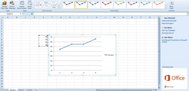
First, select a few numbers on an Excel spreadsheet. Click Insert and then select a line, column or bar graph that will have gridlines. That will add a graph to the spreadsheet as below.
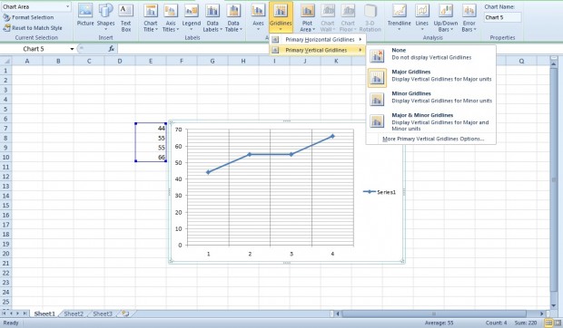
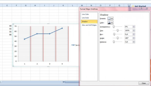
By default, the graph above has minor horizontal gridlines on it. You can add more gridlines to the chart by selecting Layout > Gridlines. Then select either Primary Horizontal Gridlines or Vertical Horizontal Gridlines as below. Select additional gridlines for the graph from the submenus. You can select either major or minor gridlines for both the vertical and horizontal axis.
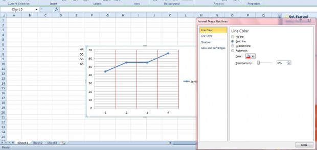
Select More Primary Vertical Gridlines Options or More Primary Horizontal Gridlines Options to open the window below. There click Line Color and Solid Line to add alternative colors to gridlines. Select the Color option to choose colors from the palette.
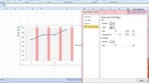
You can also add a glow effect to graph gridlines. Select Glow and Soft Edges to open the options below. Click the Presets box to choose a glow variation for the gridlines. Click the Color option to choose alternative glow colors.
Shadow is another effect you can add to the gridlines. Select Shadow and click Presets to choose an outer or inner shadow. Then adjust the shadows by dragging the Angle, Blur, Distance and Transparency bars left and right.
So with those options you can add more gridlines to Excel graphs highlighting data points in them. In addition, the extra customization options will add glossy effects to your graphs.

 Email article
