Email article

Guess what? Yeah, yes you guess it — Google has redesigned Youtube. Again.
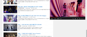
The focus of this new design is to facilitate viewing of videos and subscribing to Youtube channels. If you head over to Youtube.com, you will notice videos are pushed up to the top and everything else, including titles, being pushed down below:

If you use playlists, they will now appear to the left of your video as opposed to lower on screen. Also, note the new “Subscribe” button next to Youtube account names — that button has been introduced to get you to subscribe to channels more often.
Overall, Google is calling this a “cleaner, simpler look”. In my opinion, compared to the most recent previous design, I’d have to agree this is a cleaner look. However, there is one oddity that I noticed — Youtube is now left aligned.
It is most noticeable on the homepage but also exists when viewing videos and other pages:

Odd.
What do you think of Youtube’s new design? Let us know in the comments below!