 As I’m sure you already know, the ultimate beauty and convenience of the Android platform can be attributed to the incredible customization options you have at your fingertips. Unlike the other mobile platforms, you can truly change the entire appearance and operation of Android to suit your personal tastes. The most popular way to give Android an overhaul, besides installing a custom ROM of course, is to install some kind of launcher app. Tile Launcher is one such application that essentially turns the Android user interface into something from the Windows Phone platform.
What is it and what does it do
Main Functionality
The Windows Phone and Windows Metro UI is attractive to some (including myself). The minimal approach and overall responsiveness is part of what makes the design so attractive. Thanks to Tile Launcher, you don’t have to purchase a Windows branded device in order to experience the UI. Tile Launcher is a homescreen replacement and app launcher app for Android that is based to look like Windows Phone/Windows 8 Metro UI style.
- Replaces the stock homescreen and app drawer
- Robust customization options
- Resize, recolor and adjust tiles
- Change the app drawer theme
- Change how the launcher reacts to a tilting device (screen orientation)
- Add and resize widgets
- You can change the background wallpaper (to be expected really)
- Widgets still work perfect with the tile based UI
- The app drawer opens up like a Holo style menu
- Relatively light on system resources for a launcher
Cons
- The tiles only display app icons by default, even though you can customize this it’s nothing more than an elegant app drawer on the home screen most of the time
- I recommend you choose vertical scrolling for the pages, horizontal scrolling can really mess up your mojo (this is more of a preconceived opinion brought on by the stock Android UI)
- Requires Android 4.0 and up
Discussion
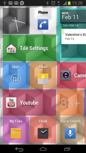
 Tile Launcher basically replaces the homescreen with a Windows Metro look-alike UI. When first setting it up you have the option to choose how many tiles are displayed on-screen and you can also select between horizontal or vertical scrolling.
App shortcuts and icons are displayed as a single tile and tapping on one will launch the respective application. You can long press on any tile to open an additional context menu that allows you to edit the parameters or delete it completely. You can change the icon, text label, and the color for both the text and the background individually. If you remember the visual style of the Windows Metro UI, every tile is a different color adding sort of a rainbow appeal. If you are a more organized type, you can change all the tiles to be the same style if you so desire.
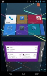
When editing a tile you can also readjust the size, and it works almost exactly like resizing widgets. An adjustable border appears around the edge of the tile which you can alter to fit your personal tastes. When you open the application drawer it pops up almost like a Holo themed side menu. Other than the mechanics, it looks almost exactly like the stock Android app drawer. For a little added customization, you can change the background of the app drawer between dark and light themes.
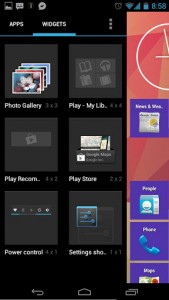
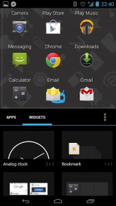 Adding widgets to the main screen is nearly the same as when you do it on stock Android too. Simply place and hold your finger over a widget in the menu and drag it onto the screen. Tile Launcher will automatically arrange existing tiles around the widget you place. A guideline appears while arranging the widget which allows you to see how everything will work out before you place it.
You can also long press on the empty space between tiles to gain access to even more options. You can add unique tiles via this menu (think action tiles like functions), configure the launcher settings, lock the existing tiles so you don’t accidentally move them around, change the wallpaper and of course you can also access device settings and the app drawer too.
One setting in particular that I didn’t mention earlier when setting up the launcher is that you can lock it to a specific screen format if you don’t want the display rotating between portrait and landscape. This is pretty useful especially for folks that like to keep their device locked to one screen orientation.
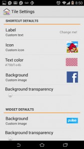 That’s pretty much it, the main different between Tile Launcher and other launcher apps is that it doesn’t replace your entire UI. Essentially, it just changes the layout of your homescreens and integrates them with the app drawer Holo style.
For reference, Tile Launcher uses about 19MB of RAM while running which means it is pretty light on resources for a launcher app. Keep in mind that memory consumption will increase or decrease depending on how you customize the homescreen (more widgets means more memory consumption).
Conclusion and download link
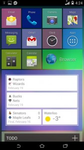 All in all, Tile Launcher is a great homescreen replacement for anyone that wants to spice up their Android device with a little Windows Phone or Metro-themed love. Tile Launcher was definitely a pleasant surprise, and the usability is definitely high. In addition, the launcher is pretty light on system resources, which is great when you want a minimal interface to replace the stock homescreen. If you want a little bit of Windows Phone or Metro-themed love, without switching to Windows Phone. If you hate the Metro UI used on Windows Phone and Windows 8 then you should probably steer clear.
Price: Free (Beta)
Version reviewed: 1.31
Requires: Android 4.0 and up
Download size: 4.1MB

 Email article
