 How many of you out there hate Windows 8 and think migrating to it is the devil’s work? Okay luddites, why wont you upgrade to Windows 8? Whenever I present this question, I always receive the same arguments in response about compatibility issues, how it’s unintuitive, how you miss the start menu, how you’re rebelling against the tablet age or how it just doesn’t get better than Windows 98. However, what I have yet to hear or read is that you won’t migrate because you’ll miss the proprietary Windows side bar.
Until recently, I forgot that it even existed. I was fascinated by it, years ago when I first initiated my jump from XP to Vista but as time marched on, I grew bored of it; it became as unnoticed and neglected as an old children’s toy. Well, that’s me and I’ll admit that I’m not a poster boy for popular tastes. I believe that there are windows 8 users out there who find that they miss the old Windows side bar, even if it clashes with the new Windows 8 metro side menu. As always with software, there’s a compromise for us change fearing folks. Today’s compromise will be Amine Dries’ MetroSidebar.
WHAT IS IT AND WHAT DOES IT DO
Main Functionality
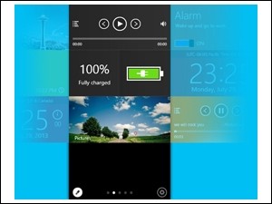
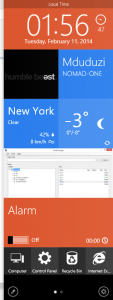 It has been rumoured and reported that Microsoft decided to remove the Windows sidebar because of a few security issues and the semantics of placing it and running it along with the new Windows’ charm bar. MetroSidebar aims to resurrect and replace the side bar, by making it more secure and thematically dressing it in Microsoft’s modern Metro UI design.
Pros
- Works on other versions of Windows but particularly blends well with Windows 8; so much so that you’d think it was designed by Microsoft.
- All tiles work independently.
- Tiles are customizable and can be added or retracted.
- Each tile can be independently configured and modified.
- The overall UI uses paging, where tiles can be added to separate pages. New pages can be added and customized individually.
- You can choose whether it starts with windows, whether it uses docking ,if it utilises auto hide or if it runs on top of everything else.
Cons
- Sometimes, no matter how much it tries not to, it still feels obtrusive.
- It isn’t initially very clear on who developed the program. I feel as if it’s a sneaky way of tricking the user into thinking that it was a project undertaken by Microsoft. Even the application and development team’s website uses the same theme and layout as Microsoft’s home page.
- Requires .NET Framework 4.
- It’s still in Beta and testing.
- It’s not dual or multiple screen friendly.
Discussion
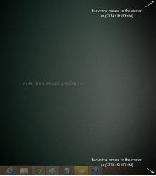 From its use of .Net and how it symbiotically latches on to Windows 8, we can rightfully assume that it was written in C++ or C# (or both). Everything about the application utilizes Windows 8’s metro style theme; from its installation wizard screens to its user interface. It’s a perfect counterfeit. Installation zooms by, promptly informing you of the application’s prerequisites and giving you usage agreements to tick and sign. After restarting your computer and running the application for the first time, it presents you with a shadow and some arrows informing you on how to summon the application; either by bringing your cursor to the corner of the screen (in the same way you bring up the metro menu bar) or tapping on ‘Ctrl + SHIFT + M’ on your keyboard. However, what it does not inform you of is that you need to click on the corner when you drag your cursor there so the application can fully avail itself. The slide in animation is slick and blends in well but unfortunately, you cannot change it.
The application gives you the bulk of its tiles as defaults. There is hardly anything that you need to add. All it’s items, take up at least a page and a quarter. There are only ten tiles to choose from; I expect this number to increase with the release version of the application. Current available tiles include an Alarm, Battery Info, Bing Search, Clock, Launcher, Media Player, Pictures, Power, User Account Info and Weather Info. Each tile comes with it’s own set of settings. For instance, the alarm tile comes with time oriented settings such as time zone and format selection. An option that every tile shares is the ability to change the colour of the tile. To bring up a tile’s settings, all you need to do is click on the edit icon on the bottom left of the screen and hover your mouse cursor over the tile and it will display four options, one that allows you to move the tile up, another to move the tile down, an option to delete the tile and a cog that takes you to the tile’s more intricate settings.
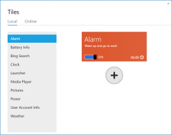 By default and I think it may also depend on the size and resolution of your screen, it will give you two pages of tiles. To add a page, once again you’ll have to select the edit icon and it will automatically append a new page to your current list of pages. To keep or claim a page, you’ll have to add tiles to it. Once you deselect the edit button, all pages with no tiles on them will disappear.
Currently, the only flavour in language that the application comes in is English. Hopefully, this will change in the future. It should be noted that the application is still in its Beta and testing phase and there are a great number of possibilities and functions, still yet to present themselves.
Conclusion And Download Link
Once again, a great application with great potential. I don’t always look at how useful an application is but what’s most important to me is that it does what it’s designed to do. Even in it’s Beta phase, the application seems very polished, though it does have it’s slight hiccups from time to time but that’s to be expected. I do feel that there is a question of principle and authenticity somewhere here but I’m still unclear on the developer’s history and affiliation so I can’t trust myself to make a remark here that wont bounce back to haunt me later. Redundant and unnecessary – maybe – but works very well. Give it a try.
Price: Free
Version reviewed: 0.2.1.0 Beta
Supported OS: Windows XP, Vista, Windows 7 or Windows 8
Download size: 4.26 MB
VirusTotal malware scan results: 1/49
Is it portable? No

 Email article
