 It’s not every day that you hear an Android user wishing their experience was more akin to that of an iOS device. In fact, most Android fans flat out hate the iOS platform, not all mind you. There is one thing that Apple devs did right in iOS 7, and that’s provide a very convenient and extremely functional control center. It works just like the Android notification tray with exception to the fact that the control center is filled with shortcuts and quick settings. Control Center iOS 7 Style is an Android application that integrates an iOS style notification bar into the OS.
What is it and what does it do
Main Functionality
Control Center is exactly what the name implies. It’s a slideout notification tray of sorts, which includes various shortcuts and quick settings like screen brightness, volume levels, Wi-Fi and Bluetooth toggles and much more. It’s essentially a comprehensive quick settings shade, which offers more options than the vanilla Android pull-down menu. Don’t worry, it actually looks a lot better than the iOS control panel and blends in nicely, because it uses a Holo inspired and very minimal theme.
- Instant access to a plethora of settings, toggles and app shortcuts
- Remains accessible at all times, even when other apps are open or the screen is locked
- You can customize the app shortcuts by assigning empty ones and editing existing ones
- Uses a holo inspired and minimal appearance that blends well with the Android OS
Cons
- Uses nearly 31MB of RAM while running, which is a bit high for Android apps
- When swipe activation is enabled it can interfere with Google Now access, and when tapping activation is enabled it can cause issues when using the software keyboard
Discussion
Let’s start off by covering who would want something like this on their Android device. Before we get to the meat of the review I’ll tell you right here and now that it’s actually quite useful all around, nevermind the iOS origins. Even if you loathe the iOS platform, you might still find this app convenient. The Android quick settings shade offers some toggles and options sure, but it’s far from a comprehensive list. Most of the settings still require you to tap an extra time or two to navigate to the Android settings menu. With Control Center, a lot of the related settings have been implemented as inline toggles or native sliders. For example, with Control Center you can adjust the screen brightness at any time with just a simple swipe gesture. Normally, you would have to navigate to the Android settings menu and then choose the appropriate options category before gaining access to the related slider.
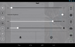
![]() By default, because the Android notification and quick settings shades are displayed at the top of the screen (on a smartphone these have been meshed), Control Center is located at the bottom of the screen. You pop it open by tapping on the target area, which can be customized in the application settings (you can make the target area cover the entire bottom of the screen or just a portion). In addition, a small arrow icon is displayed to indicate a popup menu is residing there- this icon can be disabled as well if it interferes with your current homescreen layout.
By default, because the Android notification and quick settings shades are displayed at the top of the screen (on a smartphone these have been meshed), Control Center is located at the bottom of the screen. You pop it open by tapping on the target area, which can be customized in the application settings (you can make the target area cover the entire bottom of the screen or just a portion). In addition, a small arrow icon is displayed to indicate a popup menu is residing there- this icon can be disabled as well if it interferes with your current homescreen layout.
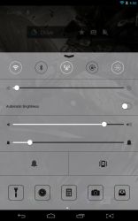
When open, the Control Center displays a mesh of setting toggles, slider bars, and application shortcuts. From the top down you have quick setting toggles, a brightness slider, volume and notification sound sliders, silence and vibration buttons (enable or disable) and a row of interchangeable application shortcuts. The topmost toggles will disable or enable Wi-Fi, Bluetooth, mobile data, portrait orientation lock, screen timeout, location access and accounts sync.
It’s great to have instant access to a lot of those settings, especially screen brightness. Since the Control Center remains usable on top of all other apps and windows, you always have access to it, as well.
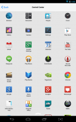
The bottom seated app shortcuts include two swipeable rows of five icons each. By swipeable I mean, five show and then you can swipe left or right to reveal an additional five. Long pressing on an existing shortcut will allow you to edit it, and tapping on an empty shortcut will allow you to assign an installed app to it. The app shortcut bar works almost exactly like a third party Android launcher.
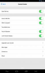 In the application settings, you can start or stop the service, and hide the arrow indicator. You can also switch between tapping the target area to recall the control center, or swiping to recall it. Keep in mind, that in Android 4.0 or higher, swiping up from the center of the screen will also call upon Google Now. If you don’t hit the target area just right, the device can sometimes register that you want to activate Google Now instead. It makes for some frustrating moments, let me tell you.
You can also enable or disable the control center being displayed over the lockscreen. Personally, I like to leave it enabled because it provides quick access to a lot of settings that would otherwise require you to unlock the device to activate. If the lockscreen is active and you tap on one of the app shortcuts, it will not open the related application until you unlock the screen. Obviously, this is a good thing in terms of security.
There is a pro version of the app available, it actually just comes in the form of a software license and you still use the free version with [presumably] access to previously locked features. Admittedly, I cannot see any major differences between the two versions, but the pro license probably unlocks access to more app shortcuts and things like that. The pro license is $0.99, which isn’t too pricey either.
Control Center works in both portrait and landscape viewing modes, depending on which orientation you prefer to use your device in. It uses nearly 31MB of RAM while running, which isn’t terrible, but it isn’t exactly lightweight either.
Conclusion and download link
 Control Center iOS 7 Style is a unique quick settings tray for Android that provides instant access to toggles and slider options that would otherwise require more work to tinker with. The target or activation area even remains on top of all other windows and apps including the lock screen, so that you retain access to the control center at all times. In addition to offering several settings toggles, the control center also includes a space for quick app shortcuts, so it can even serve as a universal launcher. It uses nearly 31MB of RAM while running which isn’t exactly lightweight, but it’s not a performance hog either. The style of the control center is more akin to the Android platform too, instead of the just traditional iOS 7 appearance: it uses a very minimal and holo based theme, and it works in both landscape and portrait viewing modes. If you want fast access to settings options like Wi-Fi and Bluetooth toggles, and screen brightness then Control Center is definitely for you.
Price: Free, $0.99 (Pro)
Version reviewed: 1.4
Requires: Android 2.2 and up
Download size: 700KB
Control Center iOS 7 Style on Play Store
Well, that didn’t take very long. It appears the listing has been removed from the Google Play store. I’ve uploaded the free version (APK) to Google Drive. To install, you will need to sideload the application, which means enabling “unknown sources” in the Android developer options. Proceed at your own risk.

 Email article
