 Unlike with a laptop or desktop, you have a limited amount of storage space on a smartphone or tablet. Especially considering a lot of devices are now shipping without external storage support, it prevents users from gaining additional storage when they use up all of their internal space. I’m sure you know how easy it is to do. Once you install a few apps, games and more that space starts to chisel away pretty fast. If you throw some music, videos or photos on your device then it practically disappears. DiskUsage is an Android application that helps you analyze your storage, and identify what’s taking up the most space.
What is it and what does it do
Main Functionality
 DiskUsage will analyze the storage on your device and tell you what’s taking up the most data. Tools and utilities like this are especially useful on mobile devices where storage is very limited. Chanc es are, you’ll find at least one or two revelatory items that you had no clue were using up so much space. This app displays the directories on your device in relation to the amount of space they consume, and presents them in a color coded style. It’s worth noting that a lot of file explorer apps like ES File Explorer include a similar tool or utility built-in.
Pros
- Analyzes storage space and displays directories in proportion to the space they consume
- You can distinctly and efficiently visualize where space has gone
- Relatively quick scan process
- Choose from multiple storage directories on your device, there are more options available if your device is rooted (not required)
- You can open any highlighted directory in the default file manager app
- You can search for specific folders or directories
- Works with internal storage and microSD external storage
Cons
- Uses about 20MB of RAM while running, which is slightly high for low-end devices
- Most file explorer or manager apps includes a similar tool built-in, so the usefulness of this tool is questionable if you have a file manager that already has this feature built-in
Discussion
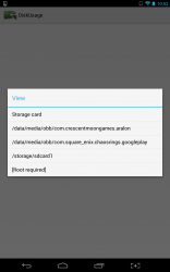 The very first time you start the application you will be prompted to choose the storage location you’d like to analyze. Most people will only have a couple options which include internal storage and external storage drives. On my device, I have several data packages mounted on my external drive thanks to Folder2Mount. Those files showed up in my list of storage options too for some reason, likely because the device has been tricked into thinking those are storage directories.
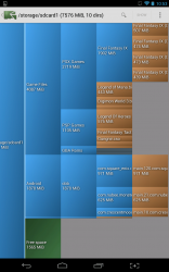
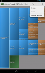
After you choose a storage directory, the application will begin analyzing the data. It doesn’t take very long at all, but once it’s finished you will be taken to the main UI. Storage directories are presented with a kind of domino effect on the screen. Each directory is presented, taking up more space in the chart in relation to how much storage used up by it. For example, the first card you’ll see on the screen is your actual storage device, along with its name and the total space offered by it. Fanning off from that, you’ll see smaller directories each with their name or category, sized respectively in regards to consumed space. I wouldn’t exactly call the chart beautiful or appealing in any way, but it is certainly a lot easier to read.
The important thing is that you can efficiently analyze your storage and confirm what’s taking up the most space, whether that be apps, media, or other elements.
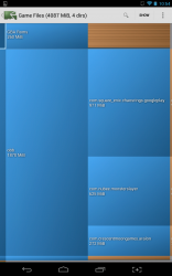
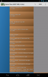 Towards the back end of the storage view, it gets quite difficult to see the names of directories or even their size. They look like tiny slivers of varying colors. That’s of no consequence though, because you can use a pinch gesture to zoom in closely and read the information. You can also tap on any card in the list to see more of its contents. It doesn’t actually take you to an additional window or menu instead it just highlights the items in the main view which are included in that particular location.
At any time you can search for a particular folder or directory by using the search function in the top menu bar. You can also open a highlighted directory in the default file manager by tapping the “show” button. This is especially useful if you want to manage the related directory or delete files.
There’s only one other useful option through the settings menu, which allows you to rescan. Tapping on it will automatically rescan the storage drive you selected during the first prompt. You can tap a back button in the top left corner of the screen (much as you would using a Holo themed app) to return to the storage selection menu.
If you have a rooted device, you can select an additional option when choosing the storage directory to analyze. This allows you to navigate to any sub-directory on your device and analyze it separately. Of course, just as I’ve already said it’s only available on rooted devices.
DiskUsage consumes about 20MB of RAM while running.
Conclusion and download link
 DiskUsage is a simple yet efficient storage analyzation tool that allows you to view directories in proportion to the amount of space they take up. You can quickly identify which items are taking up the most space on your device. This helps you save space by deleting useless files, trimming the size of a directory, or deleting it completely. While this functionality is offered by a lot of file manager tools and utilities, if you don’t have a file manager that has this capability or want an independent app that analyzes space usage, DiskUage is a great option.
Price: Free
Version reviewed: 3.4
Requires: Android 1.0 and up
Download size: 155KB

 Email article
