A Sparkline is a small chart that fits within an Excel spreadsheet cell. You can add line, column and win/loss chart Sparklines to Excel (2010 or 2013) spreadsheet cells. The Sparkline options are also included in Microsoft Excel Starter bundled with Windows 7. With Sparklines added to your spreadsheets, you can spot trends at a glance without having to set up a full-size Excel graph.
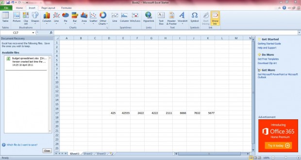
Firstly, you should open a spreadsheet with some suitable data ranges in it. Then select a cell, or a group of cells, that will include the Sparklines. Click on the Insert tab which includes the three Sparkline options to the right of the charts.
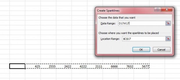
Then you should click on one of the Sparkline options to open the Create Sparklines window in the shot below. Drag the mouse over the range of cells to be included within the graph. The location range should be the cell that you selected. Then click OK to close the Create Sparklines window.
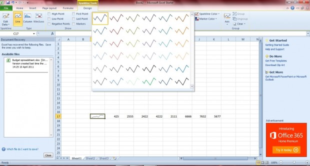
That should then add a Sparkline to the selected cell as below. Note that you can choose from a range of alternative graph styles and colors in the Sparkline Tool Design tab. Click on the down arrow at the bottom lower right corner of the box to open pre-defined styles for the graphs.
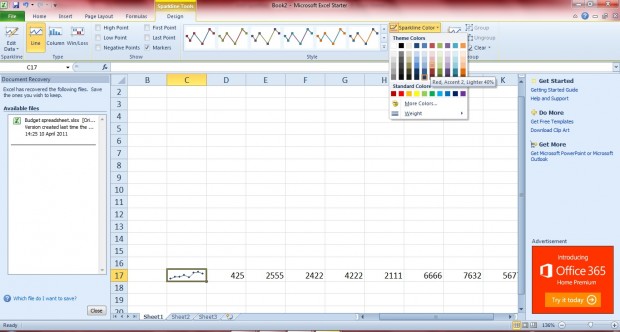
To the left of the graph boxes there are additional check-box options. Each of the check-boxes highlights a specific point on the graph, such as the high point and first point. Click on one, or more, of the check-boxes to highlight graph points as below.
To further alter the Sparkline color, click the Sparkline Color option to open the color palette below. Click on one of the small boxes to change the Sparkline color. Select Marker Color to choose alternative colors for the maker points on the Sparkline.
Overall, the Sparklines are a great addition to Excel spreadsheets. With them you can spot trends without having to set up larger Excel graphs that require greater space on the spreadsheet.

 Email article
