 I finally did it. I finally made the switch. I finally left Google for Yahoo. No, not Google’s Gmail, Android, or Maps. Rather, Google Search. Unfortunately for Marissa Mayer & co at Yahoo, I did not do it willingly and I did not stay for long. (In fact, I have already switched back to Google.)
So why — rather, how — did I switch from Google to Yahoo? Because Firefox made me and Yahoo cleverly modeled their search engine (which is powered by Microsoft’s Bing, by the way) to look very similar to Google. In fact, so similar that I didn’t even notice the difference.
If you have been reading the news, you probably know Yahoo is now the default search engine in Firefox — starting from Firefox 34, which released on Dec 1. I read the news but brushed it off not realizing the change would affect me. After all, I’ve been using Google as the default search engine in Firefox since I was in my mother’s womb. I, for some reason, figured Yahoo would be made the default search engine for all new downloads/installs of Firefox — not existing ones that upgrade to latest version of Firefox. I was wrong.
Here is what happened.
I was using my computer. As I like to do, I used Firefox’s address bar to perform a very simple search query. I found what I was looking for and opened it in a new tab, as I usually do (yes, I’m a tab freak). When I was done browsing the website I had opened, I looked around in my tab bar for the familiar “g” icon to indicate which tab was the one which I had Google open in. I didn’t find it at first glance. Confounded, I looked again. Still didn’t find it. Thinking I may have closed it by accident, I gave it another shot. That is when I saw it: the purple Yahoo icon.
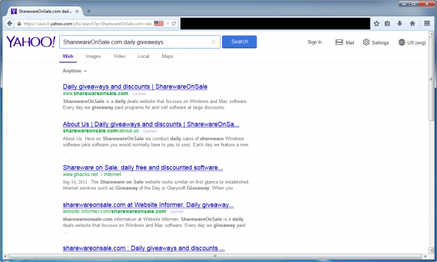
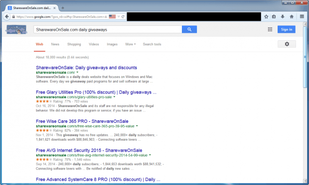
You see, what had happened is, Yahoo have designed their search engine to look very similar to Google’s and I unknowingly used Yahoo instead of Google:
Look at the two pages. Sure, they aren’t exactly the same (such as the Yahoo logo at the top) but they are surely more similar than different. Or at least similar enough to fool people into not realizing they are no longer using Google Search — people who are used to being sent to Google from within Firefox, people who skip past the logo area and go straight to the search results. Heck, it fooled me and I’m not the average Joe when it comes to tech.
It is actually a very clever move by Yahoo: it is literally forcing people to use Yahoo’s search without them making the conscience decision to ditch Google, which is often the hurdle that keeps Google Search users still using Google — it is “good enough”, so why switch? Yahoo’s goal, of course, is that by the time people realize they are using Yahoo, they will have decided to stick with it going forward.
I’m actually surprised Google is mum about this. When a competitor makes their product look so similar to your product that your customers mistake the two… well, then, you need to do something. Maybe not necessarily legal action, but something. To top it off, it looks like regular Yahoo search — the one when you go to http://yahoo.com and search from there — is not designed like what is shown above. So I can only assume Yahoo has modified the design only for users who use it as the default search engine in Firefox… which goes back to my point of Yahoo trying to gain users by trickery (and it is working).
Bravo Marissa Mayer. You got me. And millions of other people, I reckon. Too bad it was a short stay.
P.S. If you are looking to switch back to Google search from Yahoo in Firefox as your default search engine, read our handy dandy guide on how to do just hat.

 Email article


