In other articles, I’ve already told you about Data Set and Icon Set conditional formatting options in Excel. In addition to those, you can also select Color Scales conditional formatting. That adds a two or three color scale to Excel cells so that you get an instant snapshot of how numerical values in your spreadsheet compare.
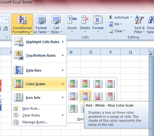
Open up your Excel 2010 (or 2013) application, and then select a group of cells to apply the color scale conditional formatting to. Next, click the Conditional Formatting option on the Home tab. Then select Color Scales to open the submenu below.
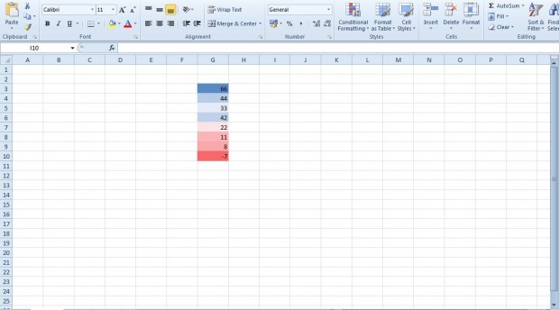
You can select a color scale from that submenu. If you hover the mouse over them, additional details for the color scales is shown as in the shot above. Then enter a few numbers in the selected group of cells as below. The colors are then applied to each of the values.
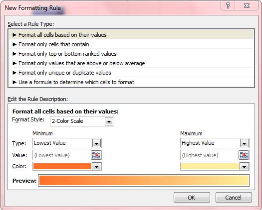
Alternatively, you can always set up your own color scale. Select a group of cells to add the scale to, and lick the More Rules button on the color scale submenu to open the window shown below. Then select the Format all cells based on their value option.
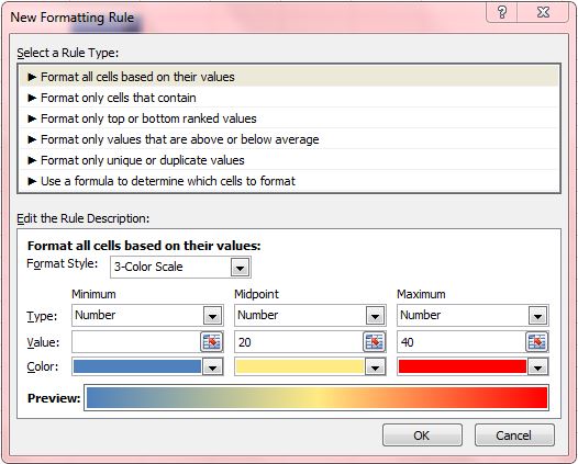
Select the Format Style drop-down list to choose a two or three color scale. Select the Type drop-down list to select a numerical format for the cell values. Then enter minimum, maximum and midpoint values for the colors. Below that you can choose colors for the scales from the Color drop-down lists. The bar at the bottom of the window shows you a preview of the color scale.
Next, press the OK button to close the window. Then enter some data in the cells that you selected. The cells will adopt the colors that correspond to the values entered. For example, you could enter a range of temperature values with the warmest vales red and the coldest blue.
So Excel’s color scales give you an alternative, and quicker, option than charts to compare cell values. Note that the option isn’t included in all earlier versions of Excel. This YouTube video also shows you how to apply Excel’s Color Scale option.

 Email article
