Email article
Scatter graphs are one of the charts you can add to Excel 2010/13 spreadsheets. You can further enhance those graphs with the addition of trendlines. Trendlines are a data visualization tool that shows the trend of values in a graph’s range. You can add various trendlines to Excel scatter graphs such as linear, exponential and two period moving average.
Add trendlines to graphs in Excel
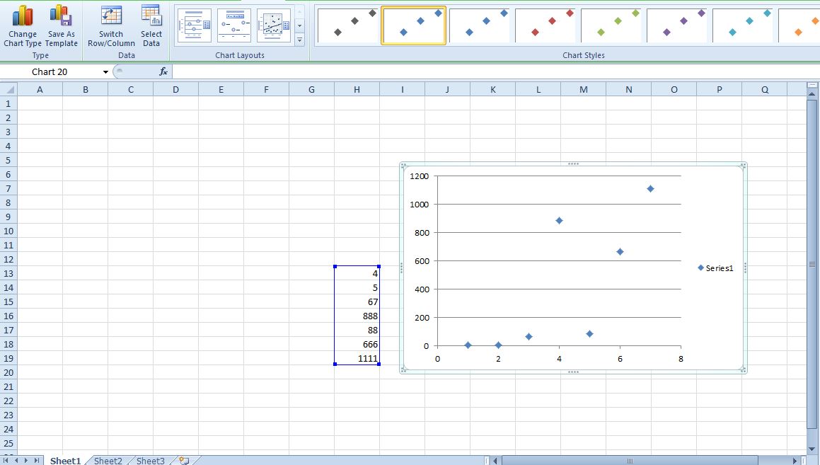
First, enter the scatter graph’s data into the spreadsheet cells. Select that data, click Insert, Scatter and the Scatter only with Markers graph. That will add a scatter graph to the spreadsheet as below.
Next, click the Chart Tools Layout tab. That includes a Trendline button. Click that button to open a small drop-down menu with a few trendline options on it.
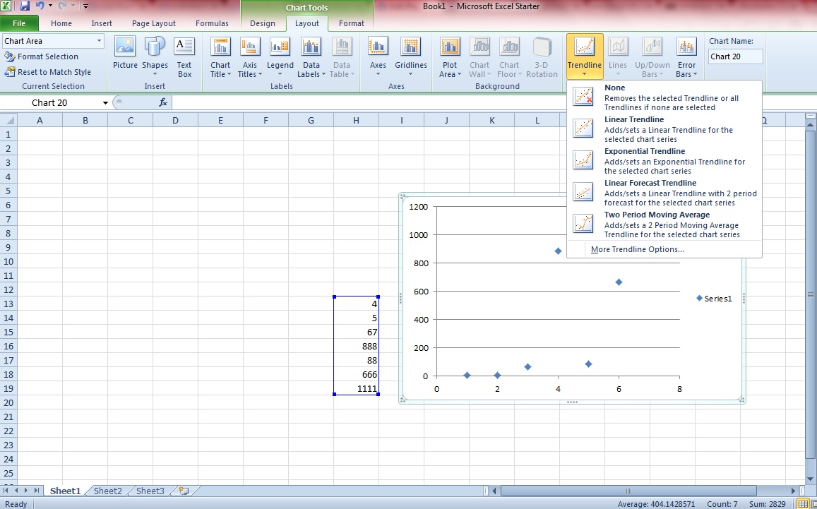
You can select a trendline to add to the scatter graph from that menu. Note that you’re not limited to one trendline. In the shot below I’ve added linear, exponential and two period moving average trendlines to the chart.

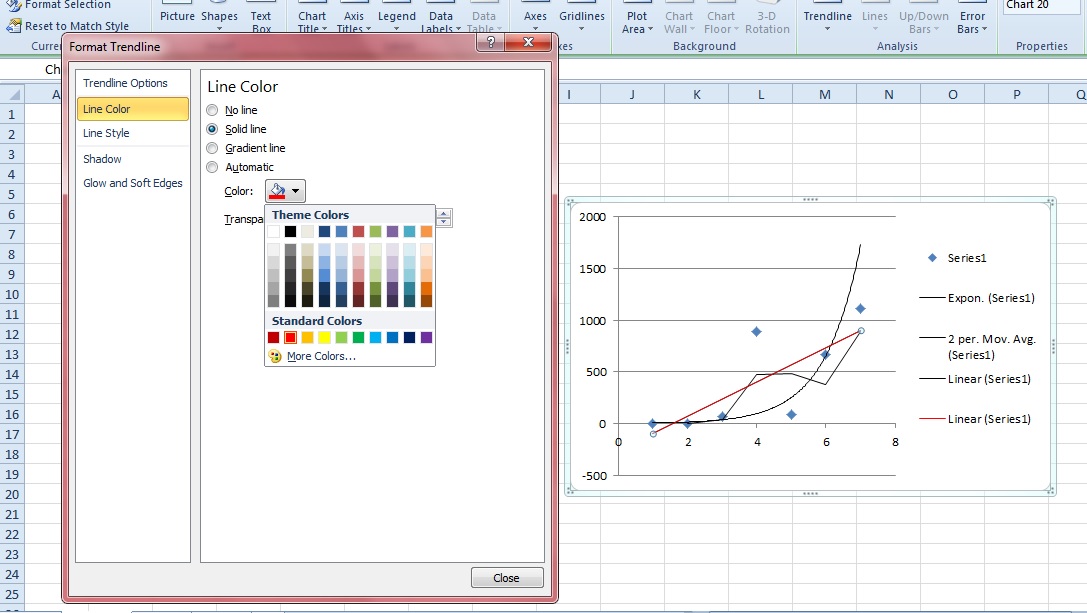
Click More Trendline Options on that menu to open the window below. That includes various formatting options for the graphs. Click Line Color and select Solid line to add alternative colors to the trendlines.
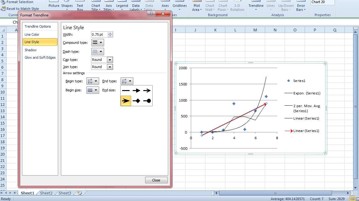
Select Line Style to add arrows to the trendlines. Add some arrows to the trendlines by selecting the Arrow settings drop-down lists as shown in the shot below. Choose an arrow from the End Type and Begin Type drop-down lists.
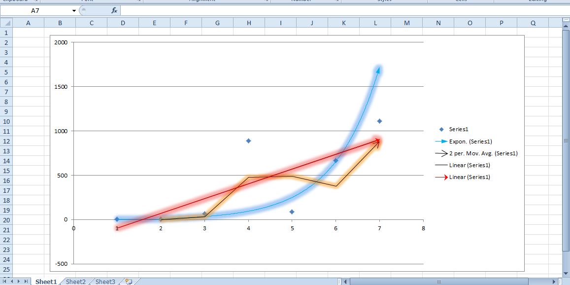
Glows effects add extra color to the graph’s trendlines. Click Glow and Soft Edges to open the options shown below. Select the Presets drop-down list to choose from a variety of glow effects. Drag the Size and Transparency bars to further customize the glow effect.

Your scatter graph could be something like the one below. You can also further format the data points in the chart by double-clicking them.
Trendlines are a great addition to scatter graphs. With Excel 2010/13 you can now add a variety of snazzy trendlines to graphs further highlighting data trends. Note that you can also add trendlines to some of Excel’s bar, column and line charts.