You can add a variety of charts to Excel spreadsheets with its graph options. In addition, you can also set up basic graphs with the REPT function. That’s a function which repeats text.
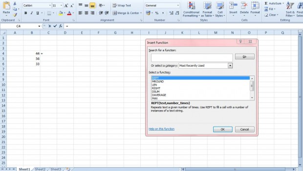
First, enter some alternative numbers in Excel spreadsheet cells as in the shot below. Then select an empty cell beside one of the numbers to add the function to. Press the fx button to open the window below from which you can select REPT.
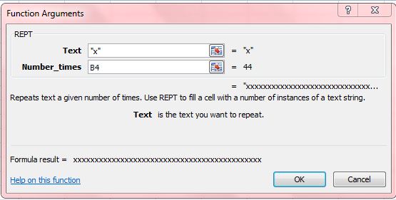
Selecting REPT opens the window in the shot below. Now you can set up the graph by entering x in the Text box. Click the button next to the Number_times text box, and select the numerical cell beside the one you entered the function in. That specifies how many times the x repeats in the adjacent cell.
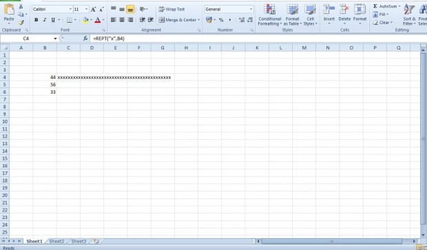
Press the OK button to close the window. The selected spreadsheet cell will now include x repeated as specified in the adjacent cell. For example, if you entered 44 the x repeats 44 times as shown below.
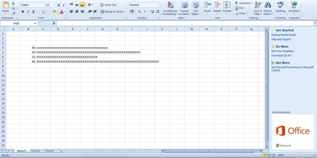
You can set up a graph by adding the REPT function to other cells in the spreadsheet much the same. When you do that, the graph could be something like the one below. The repeated x highlights a numerical value much the same as a bar in a graph.
So with REPT you can now set up charts without Excel’s graph options. You can also add alternative text colors, bold and italic to the graph with the application’s formatting options. This YouTube page also includes a REPT function video.

 Email article
