Windows is the bane and backbone of modern day computing society. For better (Linux) or for worse (Mac), the world would be a completely different place if Windows was never born. Initially outed as Windows 1, Windows of the old age is nothing like Windows now. Indeed, I’m sure the youngin’ will cringe at the sight of 16-bit Windows 1. However, Windows was created for a different time and for use cases we now take for granted, such as multi-tasking, without access to the same technology we have today; so a Windows that looks like shit today was innovation back then.
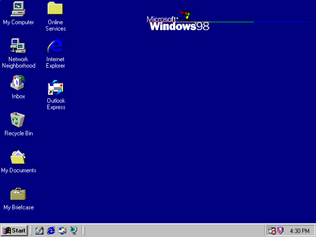
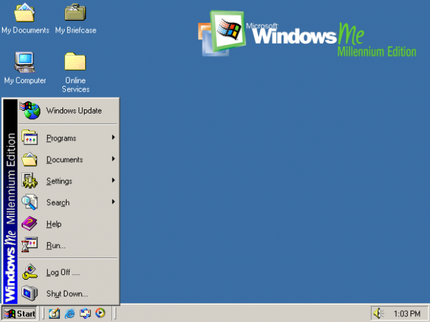
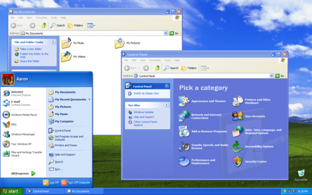
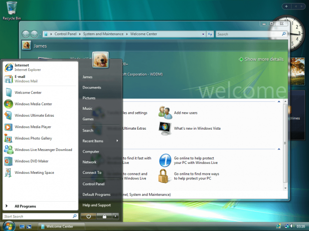
While there are, without a doubt, many feature differences between the different versions of Windows, probably the best way to visualize the transformation from the original Windows (Windows 1) to the latest and might-be-greatest Windows (Windows 8) is through their respective graphical user interfaces. And so we have compiled images of the user interfaces of Windows 1 to Windows 8 for you marvel at. Take a look for yourself:
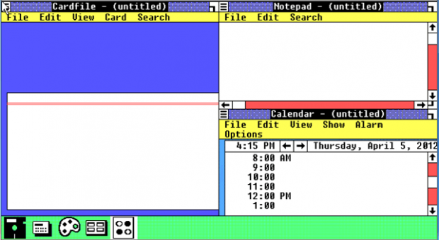
Windows 1
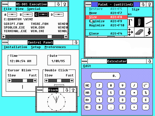
Windows 2/2.1
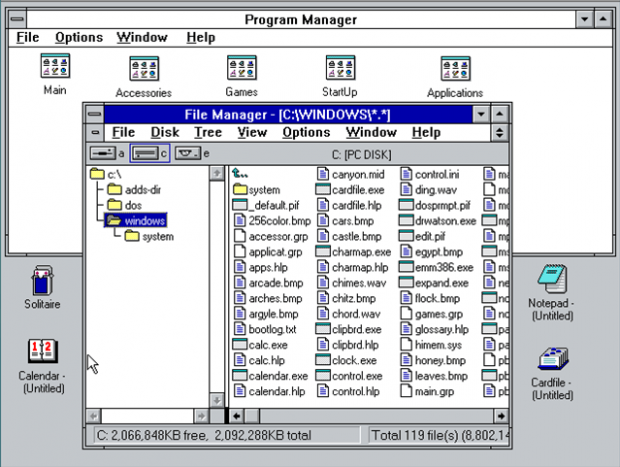
Windows 3/3.1
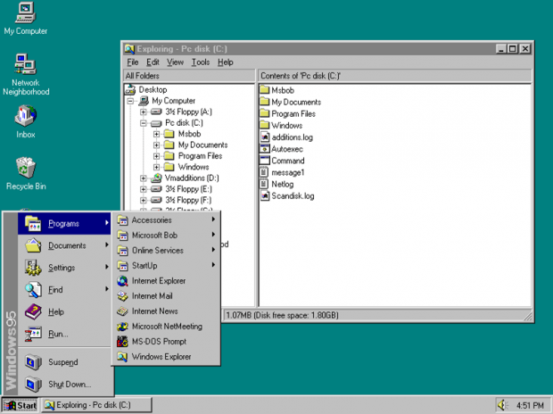
Windows 95
Windows 98
Windows ME
Windows 2000
Windows XP
Windows Vista
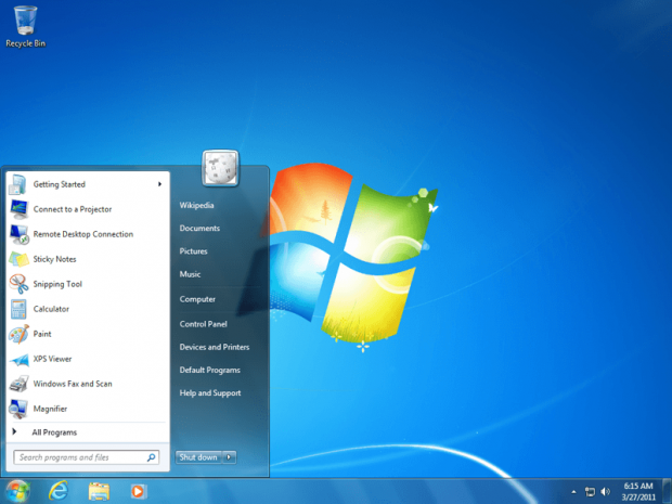
Windows 7
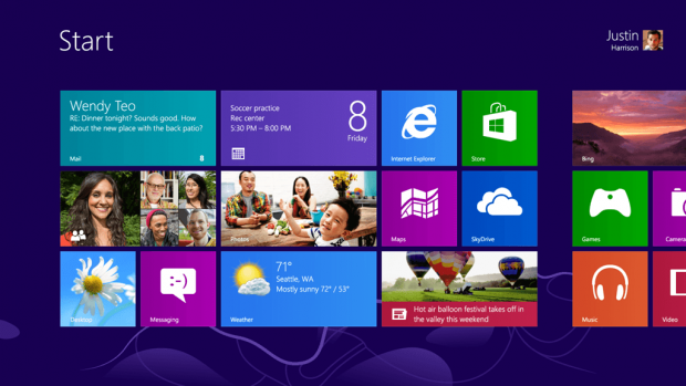
Windows 8
I didn’t notice it before but looking at the above screenshots, has Windows 8 gone back to the block/tile style of Windows 1 except with higher quality graphics? Yeah, yeah, I think it has. Touche, Microsoft, touche. Be sure to share your thoughts on Windows in the comments below.
[Images via Microsoft and Wikipedia]

 Email article
