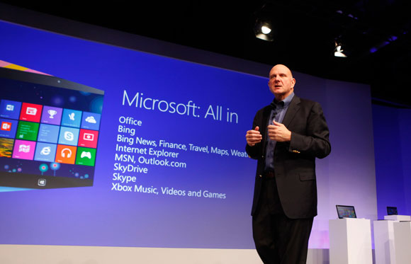
After the unveiling of Windows 8, there has always been the question of whether or not Microsoft could successfully create an essentially all-new form of Windows that is both fresh stylistically but also usable in multiple form factors, such as the tablet and more traditional desktop. Jakob Nielsen is a “usability expert” who has published a study on the usability of Microsoft’s new OS. And, according to him, Windows 8 fails. In fact, he calls it”disappointing usability for both novice and power users… weak on tablets, terrible for PCs”.
Nielsen writes in his study that things like low information density, hidden functions, and convoluted gestures severely hamper the user experience. Quite notable is the mention of the “Double Desktop”, which is the existence of the traditional desktop and the new Windows 8 Start screen.
The problems with Double Desktop, Nielsen says, is that “users have to learn and remember where to go for which features. Switching between environments increases the interaction cost of using multiple features. The two environments work differently, making for an inconsistent user experience.” Nielsen’s remark are similar to what Raluca Budiu, user interface expert, said earlier this year.
Jakob Nielsen is careful to note at the end of his study that he is anything but a Microsoft hater, seemingly want to dispel the notion that his anti-Windows-8 remarks are fueled by hatred of Microsoft. He mentions that he even made the switch from Mac to Windows — which is quite opposite to the transition we always hear about these days, people going from Windows to Mac.
Despite questions about his bias (or lack thereof), for the most part, I’d say Nielsen’s study is an interesting read as it isn’t just simple gripes from a critic, but criticisms on usability by an expert in that field, with the reasoning to back it up. Check out the full study for yourself at the source link, if you are interested!
[via BGR, Jakob Nielsen’s Alertbox]

 Email article


