 With the rising popularity of Twitter over recent years, many celebrities, sports stars, etc. have begun to use the social network as a means to reach friends, family, and fans all over the globe — with some even using it for business purposes. And with the increase in users, many developers have begun to create their own Twitter clients, with many seeking to simplify the way users interact the service. Carbon is a brand new app for Android which aims to do Twitter but better.
What is it and what does it do
Main Functionality
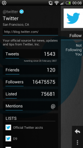
Carbon is essentially a third-party Twitter app for Android which has been designed to make Twitter simpler for everyday use. Carbon focuses around the idea that everything, yes everything, can fit onto one screen without needlessly having to bounce around many pages just to; for example, viewing someone’s profile with Carbon can be done in two simple gestures — tap and hold the tweet of the user, then select the profile thumbnail.
Pros
- Provides access to all the normal Twitter features — Timelines, Lists, Favorites, Searches, Trends, Profiles, etc.
- Instead of forcing you to scroll continually, provides auick and easy access to all features of the app with use of simple gestures
- Images and videos are pre-loaded onto Timeline
- ‘Holo’ themed interface
- Highly responsive interface (no lag between swipes or taps)
Cons
- Lack of customization options
- App does not feature a landscape-mode
- Limit to scrolling down the Timeline
Discussion
 With all of the other third-party Twitter apps, you’re probably wondering why Carbon is being featured on dotTech. Well, aside from already being widely used on the Windows Phone and webOS platforms, Carbon is a very elegant app which closely follows Android’s recommended design guidelines — making use of the ‘Holo Dark’ theme as a foundation for the Android app.
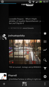
Aside from that, as noted before Carbon manages to fit everything you need on to one page. Or, it should be said that it fits in shortcuts to all features on the home screen (which can be accessed via touch gestures) with the Timeline serving as the main focus. Timeline has actually been improved upon in the app. Features images and videos pre-loaded in Timeline so you don’t have to move away from the main page to see, for example, your friends’ latest photos from Instagram. However, although this is something I’ve personally wanted for the official Twitter app for a long time, I do wish that there was an option to turn this feature on or off, as it can sometimes clutter your feed when you are more interested in just reading tweets.
I personally really like how Carbon fits almost everything on one page, which results in less of a tap-and-load response focused UI. Instead, the UI is as equally dependent on taps as it is swipes, as well as several other gestures which add to the overall appeal of the Twitter client… such as scrolling/swiping up or down with two fingers will bring you to the top or the bottom of your Timeline. And although very useful, this scrolling brought a flaw to my attention: there’s a limit of how far you can go down the Timeline of a few hundred tweets. Of course most people won’t be bothered by this limit, but some may be.
Also, one thing I have to point out as a negative is that there is no landscape-mode ability. This may not be a problem for some but does irk me quite a bit as I would like to have the ability to change the viewing mode whenever I felt to do so — something which is prevalent in the official Twitter app.
Conclusion and download link
After using it for a few days I have to say that I’m quite impressed by this app in comparison to other Twitter apps, due to the refreshing design as well as its highly responsive interface. Everyday features such as posting tweets, replies, private messages, etc. all work quite well from what I’ve seen. You may be troubled by the lack of customization options, which at this point only allow you to toggle on/off whether you would like Carbon to check for tweets and/or mentions every 15 minutes or not — nothing more than that. However, regardless of the minor negatives — which should all be fixed soon as the developers have been, for the most part, quickly responding to bugs and recommendations — Carbon is an app that I recommend to anyone that needs or wants a Twitter client.
Price: Free
Version reviewed: 1.1.5.1
Requires: Android 4.0 and up
Download size: 7.3MB
Carbon for Twitter on the Play Store

 Email article
