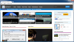
Welcome to dotTech v6! Yep, dotTech has received a makeover. And if I do say so myself, we look amazingly awesome. (Even more than before. Duh.) This is the sixth major theme change for dotTech since this humble corner of the internet was born back in 2008, and I must say: this is our best look yet.
The idea behind this new look was three-fold:
- Design our website to focus around our three main content areas, Reviews / Tips & Tricks, News, and Entertainment
- Make dotTech more useable to mobile users using a modern responsive design and better accommodate people with larger, higher-resolution monitors
- Decrease size of non-valuable content (e.g. smaller header vs larger header) and make valuable content more prominent (e.g. larger width on posts)
We aimed to meet all three of the above goals without hurting the great useability and readability we already had.
Oh and for those of you who prefer traditional blog view (i.e. simple list of all new posts as opposed to a three-column segregated design), click the “Switch to blog view” link on the homepage to change to traditional blog view.
So what do you think? Did we succeed in our goal? How do you feel about our new theme? Please do share your thoughts about dotTech’s new look in the comments below. Also, please be sure to report any bugs and issues you come across, so we can rectify as soon as possible.
Damn, life is good.
Take care,
Ashraf
Mr. Boss @ dotTech

 Email article


