 Back in September, we reviewed the Opus Domini application for Mac, a desktop organizer that looked great but hadn’t quite reached its potential yet. In the review, Brendan praised the analog look of the app, but had some pretty harsh words for the functionality and stability of Opus Domini.
While Opus Domini wasn’t perfect for Mac users, you might be wondering how its associated iPhone app stacks up. Will Opus Domini improve its reputation with a mobile app that’s more workable than its Mac cousin?
What is it and what does it do
Main Functionality
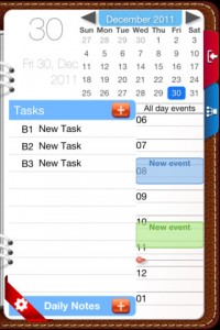
Opus Domini Mobile is an iPhone app that mimics the look of classic, paper agendas. This personal planning app is free to download, and lets you set up a variety of daily tasks, repeating tasks, and “master tasks”: overall goals or projects you are working to complete.
Pros
- Great look that mimics the form and function of a traditional paper dayplanner
- Universal for iPhone and iPad
- Ability to assign different priority ratings to each task, as well as “task status” updates like “completed,” “delegated,” in progress,” or “scheduled.”
- Supports years 2002-2021
- Page view lets you see the month at a glance, alongside the tasks for the upcoming week
- Ability to store “daily notes” in addition to tasks and appointments
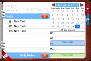
- Works in landscape or portrait view
Cons
- The app is universal, but not equally loaded with features. The iPad version has additional functions missing from the iPhone version, such as multiple planner views, master tasks with subtasks, weather info, or quotes.
- Not yet optimized for iPhone 5 or iPad Mini
- Not as robust as the Pro version for iPhone (which costs $8.99 and has more features)
Discussion
 Brendan’s biggest complaint about Opus Domini for Mac OS X was that it was unstable. If used for a long time, it would cause crashes or massive slowdowns. Additionally, he noted that sometimes he would enter events and notes, only to have them disappear later on without rhyme or reason. He said it was unacceptable, and I agree with him completely.
Thankfully, in the time that I played around with Opus Domini Mobile, I didn’t experience any loss of data. Unfortunately, that doesn’t mean that Opus Domini’s iPhone app is perfect.
Though the app is Universal, there are huge differences between how Opus Domini behaves on the iPhone versus the iPad. The iPad version has additional functions missing from the iPhone version, such as subtasks, weather info, or quotes. It’s disappointing.
While I think the layout works really well (with the exception of the use of the blue dot on the monthly view, which should be swapped out for a colored number instead,) it’s all too easy to “clutter” your virtual dayplanner. While it’s nice to have the ability to prioritize the tasks on your list, the prioritization system is clunky: you assign things an A/B/C rating, paired with a number rating (so A2 is not as important as A1). Why couldn’t it just use a color-coding system for priorities? It would be much cleaner and less overwhelming on the eyes.
Conclusion and download link
Opus Domini Mobile looks great, but scratch beneath the surface and you’ll find that this iPhone app is still far from perfect. It’s clearly improved in the months since we reviewed the Mac version, but it still has a long way to go before form meets function. There’s a lot to like, but you can still skip this one for now.
Price: Free
Version reviewed: 2.2.3
Requires iPhone/iPad/iPod Touch, iOS version 5.0 or later
Download size: 13.0 MB
Opus Domini Mobile on Apple App Store

 Email article


