Giants from gaming industry have already expressed their dislike of Windows 8 (and Windows 8 Store). Add Raluca Budiu, User Experience Specialist at Nielsen Norman Group, to the list of naysayers. In an interview with Laptop Magazine, Budiu, who has a Ph.D. in Computer Science from Carnegie Melon University and has worked at Microsoft and Xerox in the past, throws the gauntlet at Microsoft’s latest creation.
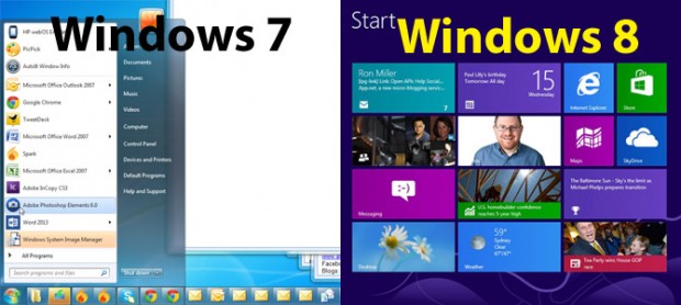
While admitting that Windows 8’s new Metro/Not Metro interface is great for tablets, Budiu feels the duality of Metro and traditional desktop in Windows 8 for desktops/laptops is a “cognitive burden”:
Users will need to remember two different interfaces. They will learn Windows 8, but won’t be able to forget Windows 7. And they will need to keep track of which app goes with each framework. [It’s] definitely a cognitive burden, but not an insurmountable one.
Budiu feels that the way Microsoft designed Windows 8 makes Windows 8 more of a content consumption mechanism rather than content creation, and, while content consumption is ideal for mobile devices, desktops and laptops have always been used for “content production and multitasking”:
Windows 8 is optimized for content consumption rather than content production and multitasking. Whereas content consumption can easily be done on other media (tablets and phones), production and multitasking are still best suited for PCs. Windows 8 appears to ignore that.
Other issues Budiu has with Windows 8 is how many of the menus, toolbars, and buttons are hidden from sight, which not only results in users needing to do more work to access the menus/toolbars/buttons but also forces “extra burden” onto the memory of users since they have to memorize which menu/toolbar/button belongs where and contains/does what. Further, the ‘hotspots’ in the corners of Windows 8 clash with traditional software design elements, such as scrolls bars, that are typically placed at or close to those hotspot areas.
While overall Budiu feels Windows 8 is less user-friendly for traditional PC tasks, she does concede there are some things that Windows 8 does better than its predecessors, such as social media integration. Also, in light of the inclusion of Windows 8’s Start screen (“Metro UI”), Budiu sides with Microsoft’s decision to remove the Start Menu from Windows 8 desktop. She feels that since Microsoft insists on having the Start screen, there is no reason to keep the traditional Start Menu since the Start screen and Start Menu serve the same purpose.
While I personally agree with Budiu that the Metro interface is not well suited for traditional PCs, it could be said that the reason why Windows 8 is/will be a “cognitive burden” is simply because it is different than what we are used to. Does different necessarily mean worse? Only time will tell. You can also tell what you think about Windows 8 in the comments below.
[via BGR, LaptopMag | Image via LaptopMag]

 Email article


