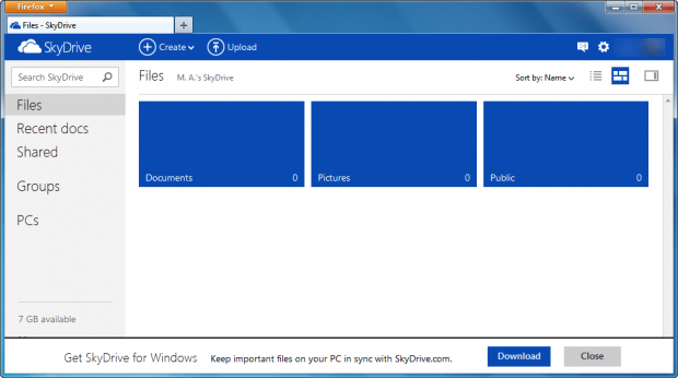
SkyDrive is Microsoft’s cloud storage service that offers ample 7GB of free online storage. Until now SkyDrive has had a Hotmail look to it, using the soon-to-be-depreciated Hotmail interface and design. That has now changed with Microsoft releasing a new and improved SkyDrive.
The new SkyDrive is part of Microsoft’s continual effort to re-brand its products in the shadow of Windows 8. As was done with Outlook.com, SkyDrive has a distinct Windows 8 feel to it with the tiles, large text, and blue bar running across the top. Aside from the obviously physical changes, the new SkyDrive comes with new features, too. Notably, SkyDrive now has instant search, the just-mentioned “contextual toolbar” that runs across the top and provides quick access to common functions, support for drag-and-drop of files and folders, and better sorting capabilities.
The following video demos the new SkyDrive:
If you are using SkyDrive from your Windows or Mac OS X desktop, you should see faster upload times and lower CPU usage when uploading files through the desktop SkyDrive program. Android users also have something to cheer. Microsoft has promised to release an official SkyDrive for Android phones “in just a few weeks”. Developers have also received something in this SkyDrive update — there is no longer any file type restrictions when uploading to SkyDrive via its API and there is a new file picker for opening and saving files.
With its recent changes, it looks like Microsoft is really trying to stick it to Google. Let’s see how well they succeed. Feel free to share your thoughts in the comments below.
[via Microsoft]

 Email article


