{rw_text}Giveaway of the day for October 3, 2009 is:
Version reviewed:
v3.4 [130]
System Requirements:
Windows 95, Windows 98, Windows NT 4.0, Windows 2000 and Windows XP (x32)
Software description as per GOTD:
Autoplay Menu Designer builds professional-looking autorun menus for CD-ROM, DVD, USB Flash drives. The user can create a project from scratch or use one of the many pre-built layouts, add graphics, buttons and interactive events to create an autorun menu with engaging look and simple navigation. The program allows one to create an unlimited number of pages for the menu and even embed several pages into one page.Autoplay Menu Designer is ideal for building autorun CD menus for different purposes. As a software developer, for example, you can create a professional-looking software installation disk, tutorial or presentation and forward it to customers. Home users can create engaging photo galleries or DVD disks with video for their home collection or to be presented as a gift to a relative, friend, or colleague on different events.
————————-{/rw_text} –>
{rw_good}
- You can create a menu from scratch or use a template (comes with 19 templates).
- Menus are fully customizable:
- You can have multiple “pages” for each menu.
- You can have unlimited buttons for each page.
- Each button can be set to do multiple tasks when clicked.
- You can add a written description for each button.
- Multiple different mouse-over effects available for buttons.
- You can insert RTF or HTML files into your menu.
- …and more.
- Has a useful “layer” (think Photoshop) system.
- You can preview your menu before you publish it.
{/rw_good} –>
{rw_bad}
- Interface organization and presentation makes the program look a lot more complicated than it actually is.
- Only “business license” users are allowed to remove the Autoplay Menu Designer watermark-like splash screen (we get “personal license” from GOTD).
- “Home Edition” (the one we are getting from GOTD) is limited to 10 pages per menu.
- You need to either move each image/file/html/rtf/whatever is associated with the menu to the “resources” folder or place all your files in the “resources” folder.
{/rw_bad} –>
{rw_score}
{for=”Ease of Use” value=”8″}The program has a lot of features; while in general using all these features is very easy, the interface needs an overhaul in organization and presentation so it does not look so… intimidating.
{/for}
{for=”Performance” value=”10″}Creates nice menus.
{/for}
{for=”Usefulness” value=”8″}I can see many people finding this useful.
{/for}
{for=”Arbitrary Equalizer” value=”7″}This category reflects an arbitrary number that does not specifically stand for anything. Rather this number is used to reflect my overall rating/verdict of the program in which I considered all the features and free alternatives.
{/for}
{/rw_score} –>
{rw_verdict}[tup]
{/rw_verdict} –>
Autoplay Menu Designer is a software that lets you create menus for external media such as USB/flash drive, CD/DVD, or external hard drive. To get a better understanding of what these menus are like, think about the “DVD menus” you see at the beginning of every DVD. The menus created by Autoplay Menu Designer are similar except they are not for DVDs… they are custom menus you create for the files you store on your external media of choice.
Now as I mentioned in my post on How to: easily create [autorun] menus for external media (USB/flash drive, CD/DVD, external hard drive, etc.), the menus you create with Autoplay Menu Designer are called “autorun menus” because they make use of autorun.inf to launch the menu .EXE file. However, in my opinion, the name “autorun menus” can be a little bit misleading because these menus can be used just fine without autorun.inf; you would just have to manually launch the .EXE associated with the menu as opposed to the menu launching automatically once you insert the external media. This point is even more critical if you consider the fact some people have autorun.inf disabled because of security issues.
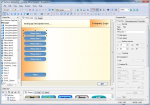
That being said, this is what Autoplay Menu Designer looks like:
The first thing I thought when I saw the interface of Autoplay Menu Designer (and you may feel the same way) is “whoa”. Not the good type of dang-that-has-so-many-features””whoa” but rather the holy-crap-that-looks-complicated “whoa”. Now that is not to say Autoplay Menu Designer does not have lot of features; it has tons of features in fact. Rather my point is the developer really needs to make some improvements on the delivery of the software; after all, how many times can you make a first impression (hint: the answer is less than two)? I am not a graphical designer or UI expert but I think a good initial step of working towards that goal is to make sure all the toolbars but the “Standard” ones are off by default (take the buttons/features available via those toolbars and put them in the drop down menus at the top). Yes, I know you can manually turn off the toolbars and many other parts of the interface; but if the user has to do that themselves, it defeats the purpose of trying not to scare the user off before they even try the software. After you get over the initial shock of “what did I get myself into” and actually start to use the software, you will learn Autoplay Menu Designer is actually fairly easy to use.
Autoplay Menu Designer (AMD) has many aspects to it. Although it doesn’t have the features of an image editor, the best way to tackle AMD is to think of it as an image editor:
- Project Bar – the project bar is, more or less, the same thing as a “layer” bar/window you may find in an image editor like Photoshop or Paint.NET:
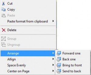
All aspects of your template, all objects, are displayed here in the “Project Bar”. Right clicking on an object allows you to do things like cut, copy, paste, delete, move back/forward, align, etc.:
Other than that, there isn’t much to do from the “Project Bar”. The real action comes when you click on an object in the “Project Bar” and go to mess with its settings in the “Properties Bar”.
- Properties Bar – this bar is the central pillar to Autoplay Menu Designer. From this bar you set things like click effects, mouse-over effects, color of the object, etc.:
Clicking on each “+” opens the settings for each property/effect and checking the box next to each property/effect (if applicable) activates. You can add as many properties/effects as you want; for example you can set a button to launch a file and open a website at the sametime when clicked.
You can set any of the properties/effects to any type of object. However just because you can, doesn’t mean you should. In other words, it would be kind of pointless to set a text description object to launch a file while for a button setting it to launch a file is sort of the point.
Since there are many properties, taking screenshots would take me all year. So to explain most of the properties/effects look at this video I created of the “Quick Guide”:
- Gallery Bar – from this bar you can pick and chose different objects to insert into your menu such as buttons, arrows, and text balloons:
Just click + drag whatever object you want onto your template/menu.
- Toolbars – the toolbars at the top offer quite a bit of functionality such as inserting new pages, inserting images, insert RTF files, inserting HTML files, inserting text, inserting shapes, etc.:
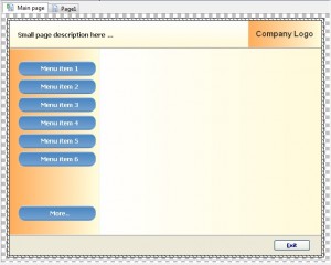
- Middle thingy – the “middle thingy”, as I so elegantly am describing it, is where you see your actual menu (all the pages and objects):
You may interact with objects from the “middle thingy” by clicking on them.
Another interesting place you want to check out is “Project” -> “Settings”. From settings you can do things like set the window size of your menu and change the icon.
When all is set and done, and you have used a combination of all the features I just described to create your perfect menu, you first want to go to “Project” -> “Preview project” to see how your menu is. Then when you are ready, go to “Project” -> “Build project” to create your menu:
When the menu is done being created, click on “Explore”, copy all three files there and the resources folder, and paste them in the top directory of your external media (CD/DVD, USB/flash drive, external hard drive, etc.).
Overall, Autoplay Menu Designer is definitely a great tool for creating menus for CD/DVDs, USB/flash drives, external hard drives, etc. so I give it a thumbs up. However it also definitely has some cons:
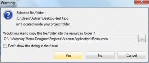
- Whenever you try to associate an image, file, or anything with the menu you are creating, you will get a message like this:
Now don’t get me wrong: I understand why the developer brings up that message and I appreciate the developer letting the user know that he/she needs to put that file in the “resources” folder so the menu can properly access it. The problem is, lets say you are using the menu to launch files you have, say on a USB/flash drive. So this is basically telling you you need to put all the files in the “resources” sub folder or they won’t work properly. So either you place each file you associate with AMD in the “resources” folder or you put all of them (putting all of them there may be easier). The developer may want to consider a pathing approach to this instead of forcing the user to put everything in the “resources” folder.
- The “home edition”, the one being given away on GOTD today, is limited to 10 pages per menu. The “home edition” also has other limitations vs the “professional edition” but I believe the 10 page limitation is the most significant.
- All “personal licenses” (we are getting a personal license on GOTD) have a watermark-like splash page to each menu:
In other words, whenever a menu is launched after it is created, you will see that splash image. Only “business licenses” can remove this splash page. I don’t know about you, but this is the biggest con with AMD for me. This is like giving me a video converter but telling me there will be a short advertisement for the developer of the video converter at the beginning of my video. I would never use that video converter. In fact I dislike this action so much I almost gave AMD a thumbs down because of it; however I decided the program is worth a thumbs up even with this blatant plug for the developer.
This review was conducted on a laptop running Windows 7 Professional 32-bit. The specs of the laptop are as follows: 3GB of RAM, a Radeon HD 2600 512MB graphics card, and an Intel T8300 2.4GHz Core 2 Duo processor.
{rw_freea}
Compact AutoRunner is an easy to use program to create menus for external media. While it is not as feature filled as AMD, it is more simple to use and still gets the job done. The biggest pro CAR has over AMD is it does not have a watermark on the menus like AMD does for “personal licenses”.
{/rw_freea} –>
{rw_verdict2}Autoplay Menu Designer is feature filled when it comes to creating menus; and it is easy to use once you get used to. Therefore, I give it a thumbs up. However, the biggest problem with AMD is “personal licenses” must have the watermark-like splash page I mentioned. I really, really dislike that. If the splash page was not there I would definitely recommend AMD. But, because of that splash page, instead I recommend you get Compact AutoRunner. If you want to grab AMD, be my guest. However I will stick to CAR and recommend others do the same.
{/rw_verdict2} –>

 Email article
