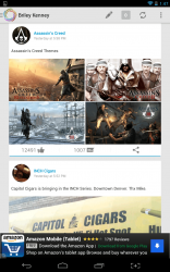
 The official Facebook app sucks. Even after quite a few improvements and performance updates, it’s still pretty buggy and slow at times. Let’s not even discuss the layout or design of the UI, that’s a completely different beast. The Google Plus app for Android on the other hand is gorgeous and responsive. Problem is, not many people really spend their time on Google Plus. What if you could mesh the two networks and come up with a happy medium on mobile devices? Klyph for Facebook is an Android application that merges the beautiful design of the Google Plus app with the Facebook network.
What is it and what does it do
Main Functionality
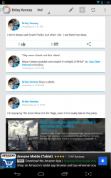 Klyph for Facebook is essentially an alternative to the official app, but it’s so much more beautiful and responsive. It uses the Holo theme to offer content in a much more engaging way. If you’ve ever used the Google Plus app before then you should feel right at home with Klyph. Of course, there should be a disclaimer, because while the UI is beautiful, the things that people post on Facebook are not so appealing.
Pros
- Beautiful and elegant UI, reminiscent of the Google Plus app
- Uses the Android Holo theme for the UI, complete with a pop-out sidemenu
- Remarkably responsive and snappy, it performs well
- There are several visual themes to choose from
- Pretty hefty on system resources as it uses about 43MB of RAM while running
- There are bottom seated banner ads in the free version
- It would be nice to see widget support, but currently there is none
Discussion
The first thing worth mentioning is that Klyph does not include support for Facebook Messenger. So, if you use Messenger you’ll have to rely on the official counterparts, unfortunately. You can always take advantage of the standalone Messenger app, and use Klyph for your other Facebook needs.
 This is a social app which means it requires access to your Facebook account in order to deliver content. If you’re not comfortable with providing a third party access to your entire account, then you should probably walk away now. It does request an alarming number of permissions in regards to your Facebook account, but that’s because Klyph is intended to replace the official Facebook app entirely.
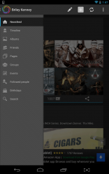
After logging into the app, you’re delivered your first batch of content. Like I said in the short intro above, Klyph looks almost exactly like the Google Plus app. Trust me when I say, there’s absolutely nothing wrong with that. Even with its minimalistic undertones, it’s still so much more beautiful than the Facebook UI in just about every way. It’s quite a bit more snappy and responsive too.
I would be remissed if I didn’t say that this app is going to replace the official Facebook app on all of my devices, it’s truly that much better.
Posts are displayed in a card style, via a single feed. As you’d expect you can like comment and share right from the feed itself thanks to interaction buttons below each post. A side popout menu offers access to additional options, which include the following:
 Any of the options you select in the list above are presented in the same minimal, card-based style.
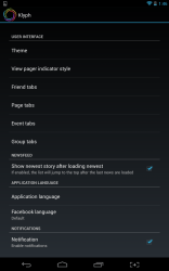
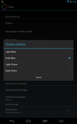
One of the best features of Klyph is that you can choose between four different visual themes: light blue (default), dark blue, light green and dark green. They all look pretty great, although I’m partial to the default light blue theme.
The biggest qualm I have with Klyph is that it serves banner ads at the bottom of the screen. I suppose since this is a free app the devs had to make money somehow, but it is certainly an eyesore. You can remove the ads by purchasing the pro version for $2.61.
For reference, Klyph uses about 43MB of RAM while running. In comparison, Facebook uses about 37MB of RAM while running.
Conclusion and download link
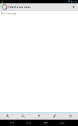 Klyph is a third party Facebook app for Android that merges the awesome interface of the Google Plus app with the Facebook network. In other words, you get the great design of Google Plus all the while using Facebook. Naturally, it’s been designed to completely replace the official Facebook app, so if you grab this you won’t really need the official Facebook app. It doesn’t throw any new features into the mix that can’t be found in the official Facebook app, so you could also say that it’s not very innovative. That being said, it’s one of the most responsive and elegant replacement apps that I’ve had the pleasure to use. You can switch between several visual themes, and customize what shows up in your feed from within the app settings. It also makes use of the Holo theme, with a pop-out sidemenu that displays additional social network features. If you’re a frequent Facebook mobile user, then you’ll definitely want to check this one out.
Price: Free
Version reviewed: 1.0.1
Requires: Android 2.2 and up
Download size: 4.8MB
Klyph for Facebook on Play Store

 Email article
