When it comes to creating presentations, we all tend to use PowerPoint (or other equivalent) presentations. PowerPoint presentations are really nice – and they are very easy to make with lots of customization available – but what if you want your presentation to standout from above the rest? For example, say you are representing your company in a bid to secure a multi-million dollar contract; you want to do something that will make your team standout above the rest (in a positive way) and thus increasing your chance of winning the contract. Well, yes PowerPoint presentations can be customized highly, can be made very aesthetically pleasing, and you can add your own uniqueness. However, a PowerPoint is still a PowerPoint; if you want to stand out above the rest and potentially stun your audience in the process, you need to use something like Prezi.
Prezi is a presentation creation platform like Microsoft PowerPoint (or other equivalent software). However, the similarities between Prezi and PowerPoint (or other equivalent software) end there. Prezi allows you to create Flash-based presentations, making use of, among other things, zoom in and out effects to create bloody brilliant presentations. If you don’t believe me, look at the following presentation created by Alison Blank:
(Start the presentation via the “Play” button and advance the presentation via mouse clicks; you can play it in full screen mode if the text is too small to read.)
Ignoring the fact that the presentation is about math, wow! Imagine having to sit throw a bunch of PowerPoint presentations and then being able to enjoy something like that. Okay admittedly that one presentation has a lot of zooming in and out and is very involved (and took a really long time to create); you may not want to create a presentation that involved unless you want to give your audience a seizure. However, I think you get my point that Prezi can truly help your presentation stand above the crowd.
Prezi presentations are built upon four basic elements:
- Content (text, images, videos, or PDF)
- Effects (zooming in, zooming out, going from point a to point b, varying the text size, etc.)
- Visual Enhancements (frames, arrows, lines, and a marker)
- Paths (the flow of the presentation)
Mixing and matching these elements allows you to create a Prezi; the more time and effort you put into a Prezi, the better it turns out to be (believe me when I say creating a Prezi will take longer than creating a PowerPoint presentation).
Now, Prezi is a bit complicated to use when compared to PowerPoint; however it really isn’t that hard to learn. I heard about Prezi Wednesday afternoon. By Wednesday night I had a Prezi created, and by Thursday (today) I presented with the Prezi I created. The good thing is that there is a fairly extensive and useful help section that provides a large amount of assistance for people new to Prezi.
Other cons with Prezi is that there is no audio support, and it isn’t as customizable as PowerPoint; there are only 9 “styles” for you to use, the font color or type are very limited, and the only “customization” to text you can make is text alignment, size, rotation, or bullet points. So, yes, if the whole world started using Prezi, Prezi presentations wouldn’t be all that amazing. However, the whole world isn’t using Prezi now are they? Only you are (hopefully).
In my short time of using Prezi, I have noticed that it can be a little quirky at times. For example
- When presenting, if the monitor resolution/size is different than the computer you created the Prezi on, your presentation may not look exactly the same (some elements may be seen on the larger screen if you place elements too close together); heck this even happens if you are creating your Prezi in non-full screen mode and decide to view it in full screen mode. This can be avoided by making sure you put sufficient space between elements (such as text, images, etc.) and make to use the “capture view” function instead of just creating paths.
- If you save a presentation while you are not at the first path, and then download the presentation, your downloaded presentation will start the presentation at the path you were at when you saved the presentation instead of starting at the first path (so make sure you save while at the first path).
- When you zoom in a lot, creating frames becomes hard.
- You can’t edit text while editing Prezi in “full screen mode” with the online editor.
However, the issues with Prezi are annoyances rather than deal-killers – the benefit of Prezi hugely outweighs the problems you may face with it. Once you get used to Prezi, you will naturally learn to work around the quirks anyway, so they aren’t that big of a deal.
Primarily Prezi is an online-based system; you need to register on their website and you create presentations via your browser. After you create presentations you are allowed to download them, or view them online. There are “paid upgrades”, however, that allow you access to desktop versions of Prezi if you ever need to create a Prezi but don’t have Internet access. Oh and did I mention that the Prezi presentations that you download are Flash based (all of Prezi is Flash based) but you can run the downloaded version of your Prezi presentation on any computer (that runs Windows XP/Vista/Win or Mac OS X) because it does not require Flash – or anything else – to be installed.
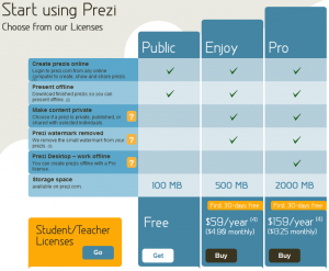
Prezi allows you to sign-up for three different types of accounts:
Everyone can sign up for a “Public” account for free, or opt to upgrade to an “Enjoy” or “Pro” account for an annual fee. If you are a student or a teacher/professor, you can get the “Enjoy” account for free and get a “Pro” account for $59/year.
So what are you waiting for? Go create your own Prezi now!

 Email article


