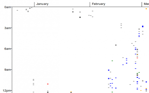
A scattergraph, also known as scatter plot, is a type of mathematical diagram that is commonly used to display or visualize values out of a given set of data. With it, you can identify and evaluate the relationships between two or more variables.
Speaking of which, if ever you’re in need of a way to visualize your browsing history in Chrome through a scattergraph, then here’s what you need to do.
How to visualize browsing history with a scattergraph in Chrome
- First, you will need to add the “Visualize My History” app to Chrome. Click here to visit the app’s Web Store page and then click the “Add to Chrome” button.
- Once you’ve successfully added the app to Chrome, you may open it directly from the same page. Alternatively, you may open it from your browser’s Apps tab or via the Chrome app launcher.
- When launched, the Visualize My History app will open a new tab in a normal window and it will automatically show a visualized version of your browsing history.
- On the scattergraph, you can identify and compare the sites according to their color. The graphs will be plotted by day (month) versus time of day. Just remember that the Visualize My History app will only show data based on your top 100 domains.
- So once you have your data in a scattergraph, you may screenshot it or save it as PDF.
By visualizing your browsing history, you can easily identify those sites or pages that you visit the most as well as determine the average time that you spent on certain sites.

 Email article


