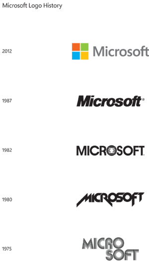
How long ago since Microsoft has changed its corporate logo? According to Jeff Hansen, General Manager of Brand Strategy at Microsoft, it has been a whopping 25 years. Now, among its re-branding attempts with Windows 8, Outlook.com, Skydrive, Office 2013, and more, Microsoft has officially unveiled a new corporate logo.
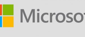
 The new logo, which can be seen in the screenshot above, is a mix of modern, clean elements combined with the traditional Windows symbol, an anchor to Microsoft throughout the years. The font being used in this logo is Segoe which, according to Hansen, is the same font Microsoft is using across its other products (such as the ones mentioned above). The different colors in the symbol represent Microsoft’s three main product lines: Windows (blue), Office (orange), and Xbox (green). The yellow, apparently, doesn’t stand for anything significant (yet).
The new logo is in stark contrast with the previous one. The previous logo, which debuted in 1987, was (is) an all black, slightly italics “Microsoft”. It had (has) no colors or images. Looking at the 1987 logo and the ones before it, the new Microsoft logo is a fairly huge departure from the part.
Personally speaking, I feel the Microsoft logo looks like it could have been created in Microsoft Paint but that is the beauty of it — it is a clean, refreshing design which goes in line with what Microsoft is trying to do with its products. What do you think about the new Microsoft logo? Love it? Hate it? Wish you thought of it yourself then sold it to Microsoft for a handsome payoff? Let us know in the comments below!

 Email article


