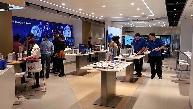
Quick, is the above image of an Apple Store? If you said “yes”, I don’t blame you because you aren’t the only one feeling that way. As it turns out, the above image is not of an Apple Store but rather of a “Samsung Experience” store (aka a Samsung store) that just opened in Sydney, Australia. Despite Samsung’s denial, doesn’t the store look eerily similar to the design used by Apple Stores? Although I am a Samsung user and fan, I would have to say yes, it does look similar. The Sydney Morning Herald, which took a tour of the store, agrees with me:
Everything from the store layout to the sales staff to the products and even the packaging and promotional material is uncannily Apple-esque.
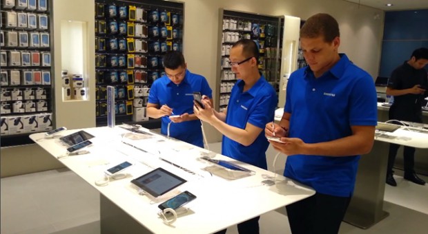
Now it should be mentioned that blue is Samsung’s corporate color so just because Apple Store employees wear blue doesn’t mean Samsung employees can’t too. And, as some commentators point out, there are only so many ways to design a minimalist store that tries to engage its customers. After all, walk into any telecom store and you will see devices laid out on tables for customers to play with. Still, though, it is hard to deny the resemblance between Apple’s highly successful retail stores and the new stores Samsung is opening around the world. Yes, this isn’t the first Samsung store to looks similar to Apple Stores. Samsung’s recent opening of its first North American store in Vancouver, Canada looks Apple-like, too:
Of course it is hard to blame Samsung for following in Apple’s footsteps. Apple Stores are regarded as the most successful retail stores in the world, and imitation is the best form of flattery, right? However, I feel Samsung should have some balls and try to differentiate itself from Apple Stores, regardless of if it truly tried to copy Apple or not because the public perception is that yes it indeed is copying. I wonder how different the stores would look if Samsung didn’t use blue so heavily. I suppose we won’t ever find out… unless Samsung changes it corporate logo.

 Email article
