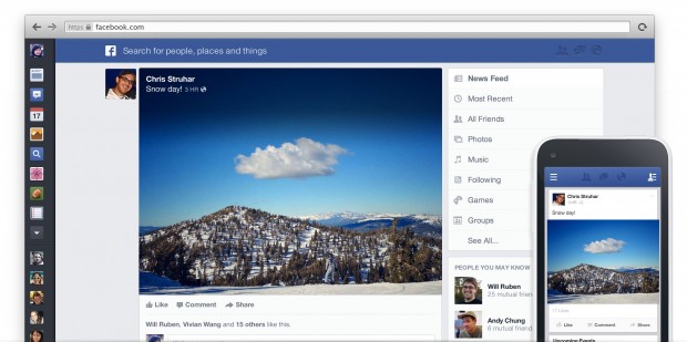
Almost a year ago, Facebook unveiled a brand new redesigned News Feed. It featured a design that look very much like its mobile apps, but made use of the extra screen real estate through large photos and a reworked navigation bar. Months passed and only a very small number of users were able to get the redesign, as Facebook continued to test it. This is what it looked like:
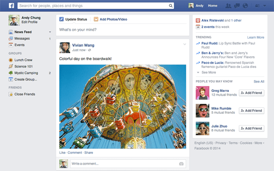
Fast forward to today, that News Feed design is never coming. Instead, Facebook is introducing a different redesign. Instead of drastically changing the way things work, the social network is instead introducing a more basic and subtle redesign to its feed:
It doesn’t look radically different from the current design, but everything has received a much-needed cleanup. There are new icons, new fonts and images are still larger. But more importantly, everything is where most people expect them to be. For a social network with more than a billion users, this might be the right move. But it’s a little disappointing that all that touting of the other redesign ultimately resulted into something that isn’t much of a change. It’s a step in the right direction, but it’s definitely a small step.
You may or may not see the new design showing up in your account just yet, Facebook is rolling it out across the world over the next couple of weeks.
What do you think of Facebook’s new redesign? Which one do you prefer? Let us know in the comments!
[via The Verge]

 Email article


