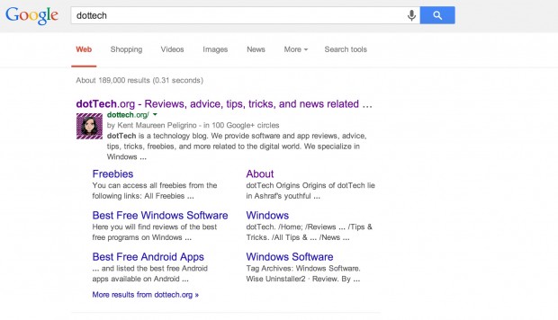
If you’ve somehow avoided Google’s search page recently, we are hear to tell you it just got a little facelift. Google rarely ever changes the look of this page, and when they do the changes are usually very minor. The new changes stay true to that, but are significant in that it’s left behind a very old design choice in web design: hyperlinks are no longer underlined.
In addition to that change, line spacing has been evened out and the font size has been increased. The result is increased readability and a much cleaner look, one that takes cues from the mobile version of the page. Google’s Jon Wiley, who is leader designer search, believes the consistency is key to making Google Search better:
Improving consistency in design across platforms makes it easier for people to use Google Search across devices and it makes it easier for us to develop and ship improvements across the board.
What do you think? Are the changes better or for worse? Let us know in the comments below!
[via Jon Wiley (Google+)]

 Email article


