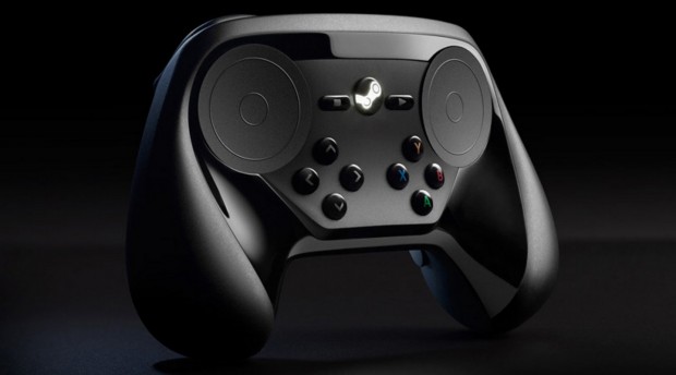
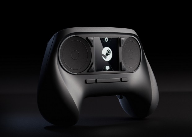
Valve has updated the design and layout for its Steam Controller and will show it off this week at GDC 2014 (Game Developers Conference). When the Steam Controller was first announced, it featured dual trackpads with a large touchscreen in the middle. Prototype controllers were sent out to testers and included four large buttons instead of a touch screen, mostly due to the controller’s design not being finalized. Pictured below is the Steam Controller as it looked when it was announced:
The new controller has foregone the touchscreen and now has a more traditional layout — except for those large trackpads of course. There are two pairs of four buttons on each side where the touchscreen used to be, resembling the d-pad and face buttons of other controllers. Above the face buttons are three buttons: what looks like Stop and Play buttons which will possibly function like Select and Start and a large Steam logo that will most likely be just like the Guide button on Microsoft’s Xbox controller.
Overall, the new controller looks more like a balanced combination of traditional and new input methods. But whether or not that will result in a better controller, and one that will be capable of playing games meant for mouse and keyboard (Valve’s goal), remains to be seen.
[via Polygon]

 Email article


