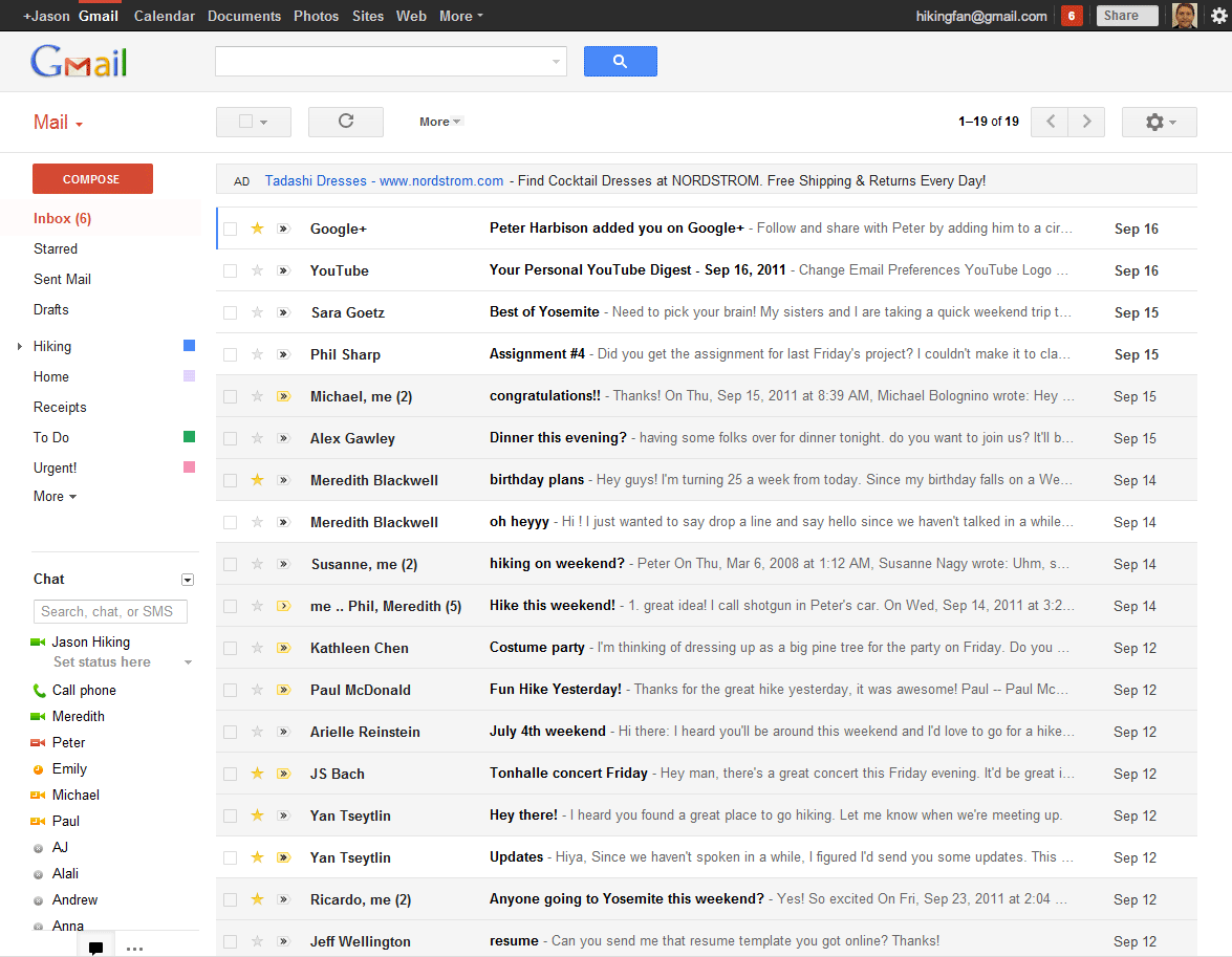
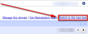
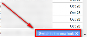
Today as you log into Gmail you may notice a Switch to the new look link near the top-right or bottom-right corner of your inbox:
Clicking on this link transforms your Gmail into the the new and improved Gmail; call it New and Improved Gmail by Google, if you wish.
What exactly has changed? Well, obviously the design: The new Gmail design is “cleaner, more modern”. (Although, some people, including me, would argue this new design – that involves scrolling a part of the window but not all of it – isn’t modern — it is annoying.) In addition, Gmail now supports more themes (specifically high resolution themes), the way e-mail conversations are displayed has been modified, you are given the ability to select how “squished together” your e-mails are displayed (“Display Density”), you can modify the chat window, e-mail search has been improved with added filters and better useability, a new button at the top allows you to switch between mail, contacts, and tasks, and a new toolbar replaces the current one that is displayed above e-mail messages/top of the inbox. The following short video demonstrates the just-mentioned changes:
Want to try these changes for yourself? Log in to your Gmail, find the Switch to the new look link, and click on it. (You can also revert back to the old style.) If you want to learn more about these changes without actually taking the dive (yet — this new Gmail is optional for now but will become the default in the near future), hit up the links below.
Google Blog official announcement
[via Engadget]

 Email article
