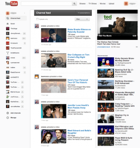
Google continually works towards designing its services to improve user experience or to better integrate its various products together. Reports have emerged that Youtube is receiving another new design (so quickly after its most recent one), this time inspired by Google Plus.
The key thing to note here is the new design is not publicly available, yet; it is available only to a select number of users (presumably people who use Google Plus and Youtube). According to an official comment by Google to Engadget, the new design is an experiment and Google will consider rolling it out to the masses based on user feedback:
With more videos coming to YouTube every minute we’re always experimenting with ways to help people more easily find, watch and share the videos that matter most to them. As always, we’ll consider rolling changes out more broadly based on user feedback on these experiments.
As expected, the new design brought in both good and bad comments; the good being that the new design provides more space and is neater. Interestingly, the bad as reported by many is that the layout featured more white space (hence wasting space for other content). With such conflicting feedback, it is dependent on personal test to determine if the new design is good or bad.
In the past there have been some changes made by Google to their products which have brought criticism. But, the changes for the bad were mostly rolled-back or redesigned upon negative feedback from users. Just to name one, a favicon change around May 2008, which drew bad comments from users, was replaced by another one (the current default) on January 2009. So only time will tell if this Youtube change is permanent or Youtube’s mid-life crisis.
What do you think of this new layout (as you can see from the screenshot above)? Share your thoughts with us in the comments below.
[via Engadget]

 Email article


