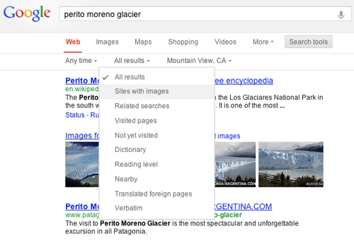
Back in September I posted about a new change to Google that brought the navigation menu on the left to the top; a change I dubbed as more Bing-like. At the time, while some other people saw the same thing as me, Google had made no official announcement about the change nor did they roll out the change to everyone. That, my friends, has now changed.
Google yesterday announced the changes to Google.com, as mentioned in my previous post. Now all the “Web”, “Images”, “Maps”, etc. links appear below the search bar on Google.com rather than to the left. According to Google, this change is first being pushed out to US-based users of Google.com; users outside the US and of international versions of Google should see the change in the near future.
Feel free to comment on how you like this new change, in the comments below.
[via Google]

 Email article


