I love reading, and I know a lot of people do too. The internet is such a great way to find great articles to read, and that’s where dedicated news readers come in. These applications allow people to aggregate all of their favorites sites and read articles in one app, rather than visiting each site individually. News Bento does this task really well in Windows 8.
What is it and what does it do
Main Functionality
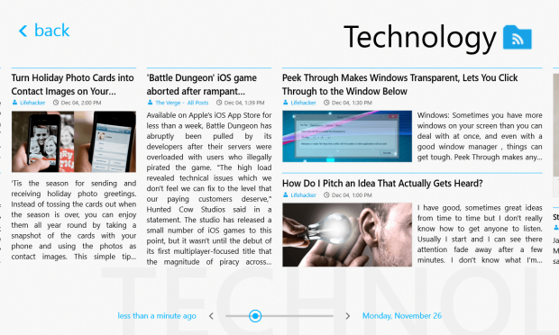
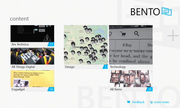
News Bento is a program that acts as a magazine-style reader for all of your news sources. It syncs with Google Reader and also with any other RSS feed you want. The program uses Windows 8 tiles, which work beautifully for displaying the face image and title of an article. All of the different feeds (channels) are live tiles which show the newest posts; the whole app looks designed with touch in mind, but works well with keyboard and mouse as well. Overall, it’s very similar to how the Windows 8 Start Menu works but is dedicated to news.
Pros
- Touch-friendly
- Beautiful and adjustable tiles
- Windows 8 Modern UI works with this app
- Syncs with Google Reader
- Ability to view original website
- Viewing articles is a breeze
- You can add any RSS source you want
Cons
- Main screen, when app opens, is awkward for mouse control
- Some icons are a little blurry
- Images from articles aren’t optimized for large display
Discussion
News Bento is a really good news reader that uses the Windows 8 Modern UI. It’s great that it can sync with Google Reader, which allowed me to quickly set up the app for my needs. I think a very quick and painless setup is very important for these types of apps since most people try multiple ones before finding the perfect one for them.
Once you sync with Google Reader, you can pick which feeds to see. I chose to keep all three of my categories (Technology, Design, and All). You can also choose feeds that are already in the app, or even add a new site. The ones included in the app range from Business to Art.
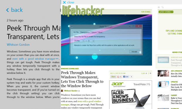
After you select the sites you want to view content from, it’s the fun part. Reading in News Bento is great. The app loads an easy to read version of the article akin to something like Pocket or Readability. If you want to read the content on the original site, you have the option to. Once clicked, screen splits into two and displays both versions. It looks really nice and for well designed blogs, either way is a joy to read on. I imagine that reading on this app from a mobile device such as a tablet will yield great results.
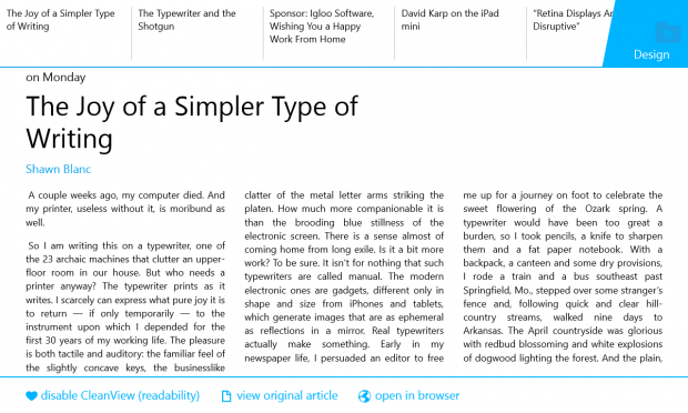
Another feature that’s available in the app is ClearView. What this does is allow you to read the content in an even “cleaner” way. In my opinion though, I didn’t find that it aided me in reading at all. On the contrary, it made it almost harder to read with it. If you still want to try it, a right-click when you are in an article should do the trick. Additionally, when you right-click, you can see the other articles in the feed on the top section of the screen. With that, there’s also the options to view the article on the original site and have it marked as read.
If you really enjoy some of your feeds, you don’t have to go through the app each time you want to read. You can select your feed by a simple right-click and pin it right to the start menu. This means that as soon as you boot up your computer, viewing the new content you have to read is just a click (or tap) away. One thing I do have to note, though, is that once you start pinning tiles to the start menu, they can sometimes cause confusion to which one is the real app and which ones are just feeds. It’s just something I have noticed while using the app.
Unfortunately, not everything is perfect, although there isn’t all too much to complain about. One thing that can look ugly in the app are images. For example, when you first open the app, you are greeted by a large version of a tile. It basically showcases the newest articles available to you. The problem though, lies with the size. Since the tile covers the whole screen, so does the image, and often it makes it look blurry. Not a huge problem, but it’s something you will notice (you won’t notice in the first screenshot below image since the screenshot is scaled down). Also, the small icons near the title of the feeds look blurry (see last screenshot below).
Conclusion and download link
All in all, there isn’t much to complain about for this app. The Windows 8 Modern UI actually works here, and is a pleasure to use. Reading articles is great and the layout of this app allows you to structure your feeds however you want. The app seems like the perfect fit for touch devices but also works well on a desktop or laptop. If I were to name one really big drawback of the app, it would be the fact that some images displayed are blurry, but even that isn’t too bad.
Price: Free
Version reviewed: Unknown
Supported OS: Windows 8, Windows RT
Supported architectures: x86, x64, ARM

 Email article
