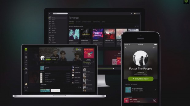
After a couple of weeks of testing it through a number of users, Spotify has opened up its biggest redesign to everyone. The redesign extends to Spotify’s web player, desktop and mobile apps. It’s pretty much a dark-themed Spotify that maintains its trademark green and makes better use of images for artists and albums, but the result is undoubtedly very attractive. In addition to the aesthetic changes, the redesign brings with it the oft-requested features of Collections. It basically means that it’s now easier to build your own music library of sorts within Spotify without having to resort to starring items and using playlists.
- Content is king. Our new design makes accessing your favourite music smoother than ever before. The new dark theme and refined interface lets the content come forward and ‘pop’, just like in a cinema when you dim the lights.
- It’s Your Music collection. Save albums and browse their beautiful cover art, gather your favourite artists and create playlists for every mood and moment. Found a song or album that you like? Just hit save to add it to your collection. It’s that simple.
- We know you’ll love it. We’ve listened to all your great feedback to ensure that everything looks and feels just right. You told us you preferred a darker interface – so here it is.
https://www.youtube.com/watch?feature=player_embedded&v=V1I6-wv0p8k
After recently acquiring music intelligence company, The Echo Nest and now releasing a much improved design, it seems Spotify has no plans of relinquishing its lead over rivals like Rdio. You can download Spotify for free on your platform here.

 Email article


