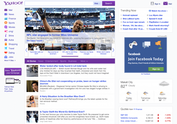
As part of CEO Marissa Meyer’s ongoing effort to bring Yahoo back to its once dominant ways on the web, the company has unveiled a newly redesigned homepage. It features a new look with cleaner lines along with a host of personalization options. They sure love redesigning stuff over there!
The changes to the homepage’s look is probably my favorite upgrade in the redesign — everything looks cleaner, and despite it still being pretty busy overall, it’s easy to look at. For most users (and Yahoo), however, the biggest upgrade comes in the form of the personalized infinitely scrolling news feed. The feed is similar to the ones you’ll find on Facebook and Twitter, and after some testing, I find that it works pretty well.
Speaking of Facebook and Twitter, you’ll also be able to quickly share articles on from the feed using a button that appears when you hover an article. The feed will also show you content recommended by your Facebook friends. Clicking ‘remove’ on an article will also give you the option to choose to see less stories of a certain topic, potentially allowing for a more personalized version of Yahoo over time.
Whether or not this is the big change that Yahoo needs is anyone’s guess at the moment, but it looks to be the right direction at least.
The update appears to have been rolled out worldwide, so head on over to Yahoo.com and tell us what you think!

 Email article


