Updated 6/29 with a better script.
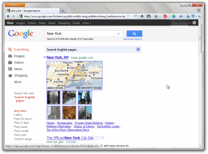
As part of Google’s newest, most social redesign yet, the search engine giant has decided to go for a whole new color scheme, one of whites, reds, greys and blacks, as apposed to their old scheme of light blues and whites.
This new black bar, which many find ugly and brackish, doesn’t quite fit in to the rest of the search results page.
Luckily for all internet users, Greasemonkey script writer Olmer has created a script to fix the bar and make it white again. To install this script, you’ll need to prepare your browser. Chrome and Opera have built-in user script support, while Firefox and Internet Explorer do not. To prepare Firefox, just install the Greasemonkey addon from the official Mozilla Add-Ons site.
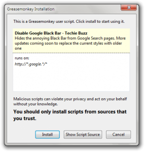
After preparing your browser, go to the script’s official page. Click on the install button; depending on the browser you’re running, you’ll get one of many prompts.
In Firefox, you’ll get a popup window asking you if you want to install this script to run on the site /google/. Just wait for the countdown and hit yes:
 In Chrome, it’ll ask you if you want to install the script by showing a message in the Downloads bar:
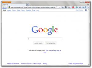
![]() After you’ve installed the script, try visiting Google.com.
After you’ve installed the script, try visiting Google.com.
Voila, the navigation bar is back to its beautiful, clean white self and even keeps the new search box to compliment it. This fix, which is more permanent than the previously mentioned script by Techie Buzz, is just one way the internet shows itself to be independent. What’s your least favorite thing about the new redesign? Do you love it or hate it?

 Email article


