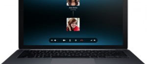
 Skype is an integral part of our online lives. A lot of discussions and interactions online get done on Skype. Right from discussing the next big important deal with your client abroad, to a simple chat with your loved ones back in home, Skype has been pivotal. Skype has always been providing us free video chatting for ages and there is a reason why we use it despite other alternatives. So how does our favorite video chatting app rate on Windows 8? The whole Skype experience is now centered around the Modern UI. And using Skype is now more simplified. Though this is definitely not for the best.
What is it and what does it do
Main Functionality
Skype allows users to call and video chat with people across the globe via internet for free.
Pros
- Simple and Intuitive Interface
- Video and Call quality has improved
- Good integration with the People app
- Integrated with MSN messenger
Cons
- File transfer missing
- Notifications is a hit or miss
- Desktop mode integration is lacking
- Using two accounts seems impossible
- Lack of conference calling
Discussion
As soon as you fire up the app, you get the Skype Screen and then are introduced to the new home screen. It is simple and really intuitive But the bare bones interface is double edged sword with many users complaining about wasted screen space, but that again is a personal choice. Rest assured even with the new interface the old functionality is still maintained.
The video calling, group chats and audio calling work just as expected. The quality does seem better. Not probably as good as face time but it has improved. And plus points to interface again here. Calls by default open full screen. A simple yet profound change.
Skype had SMS support right from before. You could always text your contacts using SMS credits but now Skype is very well integrated with the People app. You can now directly call or text right from your contacts.
 Notifications. Bad experience. The whole skyping experience relies on notifications. Once you shift to desktop mode (which is quite often) there seems to be a lack of coordination. I got notified for the same messages that I had just seen when I switched to Desktop mode. And when you switch interfaces, the app stops to update. The app seems to be suspended. You get the updates only when you switch back to the app. Real time updates again is a hit or miss.
Figuring out where the settings was took some time. I thought a button here or there would have been helpful It is not that Skype is having a screen space problem. You have to open charms bar and select options for settings. Unintuitive I felt.
File sharing is conspicuously absent in this version of the app. This is one important feature that many users used and I hope this feature comes back soon.
You can’t hide offline contacts. All contacts are shown by default irrespective of the fact whether they are online or not. And a way to organize contacts would have helped.There is no conference call feature too. Something like Hangouts would be very welcome indeed.
If these cons bother you, you can install the Desktop version of the app and use it. And yes, you can have the best of both the worlds by installing both the versions. But both have the same icon and it drives you crazy trying to figure out which one is which from the start menu.
Conclusion and Download Links
In conclusion, Skype for Windows 8 is good. Some of the new features are brilliant and the new interface is snazzy. But there are some major drawbacks and some of the things which we had taken for granted in the other versions are lacking here. What I would recommend is installing the x86 desktop version of the app.
A little bit of thought and updates for the Desktop users and this app would definitely be a runaway success.
Price: Free
Supported OS: Windows 8, Windows RT
Supported architectures: x86, x64, ARM
Skype on Windows Store

 Email article


