And right on cue, Yahoo has unveiled their brand new logo. After a month of cycling through a new design each day, the company showed off what they believed to be the best of the bunch. Take note, Yahoo hasn’t updated their logo in 18 years! Check it out:
According to CEO Marissa Mayer, they wanted the logo to be “whimsical, yet sophisticated. Modern and fresh, with a nod to our history. Having a human touch, personal. Proud.” In her Tumblr post announcing the new logo, she also shared a little bit of more info behind the creation of the logo and its different elements:
- We didn’t want to have any straight lines in the logo. Straight lines don’t exist in the human form and are extremely rare in nature, so the human touch in the logo is that all the lines and forms all have at least a slight curve.
- We preferred letters that had thicker and thinner strokes – conveying the subjective and editorial nature of some of what we do.
- Serifs were a big part of our old logo. It felt wrong to give them up altogether so we went for a sans serif font with “scallops” on the ends of the letters.
- Our existing logo felt like the iconic Yahoo yodel. We wanted to preserve that and do something playful with the OO’s.
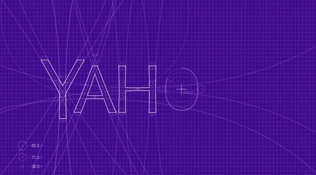
- We wanted there to be a mathematical consistency to the logo, really pulling it together into one coherent mark.
- We toyed with lowercase and sentence case letters. But, in the end, we felt the logo was most readable when it was all uppercase, especially on small screens.
Personally, I liked one of the other logos they used during their “30 days of change.” It just felt more modern to me, and felt right with all the new stuff Yahoo has been doing lately:
What do you think? Does Yahoo’s new logo hit the spot, was the old one better, or should they have gone with another logo completely? Let us know in the comments!
[via Marissa Mayer (Tumblr)]

 Email article


