After Twitter’s first earnings report was released, investors were disappointed by the company’s lack of growth. Twitter has been experimenting with making itself more accessible by adding things like inline photos, a bigger focus on media and easier ways to send private messages. The latest change may be taking a page out of Facebook, and making Twitter closer to a traditional social network like Google+ or Facebook more than ever.
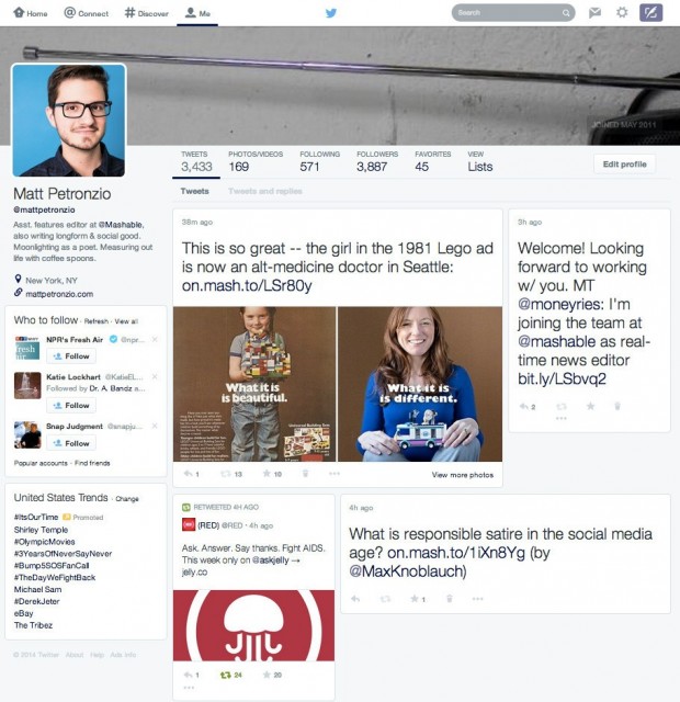
Mashable reports that Twitter is experimenting with a complete redesign of its user pages featuring large profile images and a Pinterest-style layout for recent tweets. If you squint a little and didn’t know it was Twitter, it’s entirely possible to mistake it for Facebook or Google+.
But like many of its other experiments, there’s a chance that this might not even see the light of day. However, considering that Twitter’s profile pages are hardly anything but a simple bio and a regular column of tweets, this change could lead users to cultivating or caring more about their profiles. Most importantly, its familiarity could be the company’s key to getting the users it seeks.
What do you think of Twitter’s redesign experiment? Let us know in the comments!
[via Mashable]

 Email article


