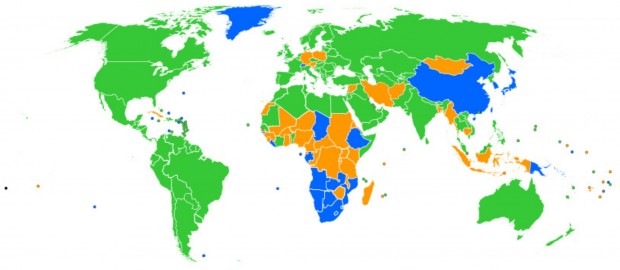
Pretty much everyone I know these days uses Google Chrome. I know a couple of people that use Mozilla’s Firefox, and even fewer people that are on Safari or Internet Explorer. I currently don’t know anyone that uses Opera. That’s what it’s like in my part of the world at the moment, and it might be extremely different for you depending where you live.
This handy little usage list in the form of a map (see above) comes from StatCounter, and is a pretty easy way to see what browsers people like to use around the world. The results in terms of amount of usage shouldn’t be too surprising, but seeing where all the usage comes from is very interesting. Here’s what the different colors represent, in descending order of popularity:
- Green – Google Chrome
- Blue – Internet Explorer
- Orange – Firefox
- Grey – Safari
- Red – Opera
If you find yourself squinting, don’t forget you can click the image to get a bigger and better look at the map.
So, what browser do you use, and in what country are you in? Feel free to share with us in the comments below!
[via StatCounter, Gizmodo]

 Email article


